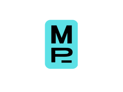
Meetpod Inc. Logo
Another fictional company lol...
This one is a company that's supposed to list places and encourage people to meet face-2-face in Singapore.
The blue in the logo symbollises trust and transparency. The squircle around the M and P is supposed to be an actual pod (which was the original idea for a meeting pod).
I'm doing A/B testing on this logo, so I'm going to follow up with another version of it. Would be really glad if you guys could like/comment on the one you think is better. Thanks.