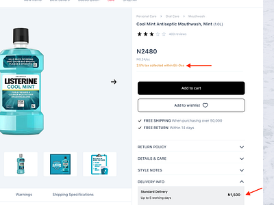
Product Page of E-commerce Website
7 of 15 ways I’d improve the product page UX of an e-commerce platform is to Show Additional/Hidden Costs on that page.
People shouldn’t have added an item to cart before seeing additional/hidden costs like taxes, shipping costs, oversized item fees etc .
There are instances where these additional costs become a surprise at checkout, leading to possible abandonment because an estimate wasn’t provided on the product page.
More by Tochi Louis View profile
Like
