Things for Apple Watch Reconsidered
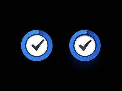

Looking at the new icon for Things for Apple Watch (left) I was struck by a great concept (a riff on the activity/fitness app) and execution that could be improved with a few extra details:
In my own version (right) I've changed several areas:
• Considering the heavy black background, I've added extra saturation to the blue border color.
• Used shades of blue for shadowing on activity ring as opposed to shades of grey for a more natural lighting scheme. (See attachment).
• Added highlights on the activity ring
• Optically centered the checkmark glyph to create better balance.
• Added depth and contrast to the checkmark including a small hint blue.
• Exposed depth and shading on inner area of basin.
All that said, I do understand that there are some external limitations on how far one can go in these regards, and Cultured Code is pushing boundaries with their consistently great design work .