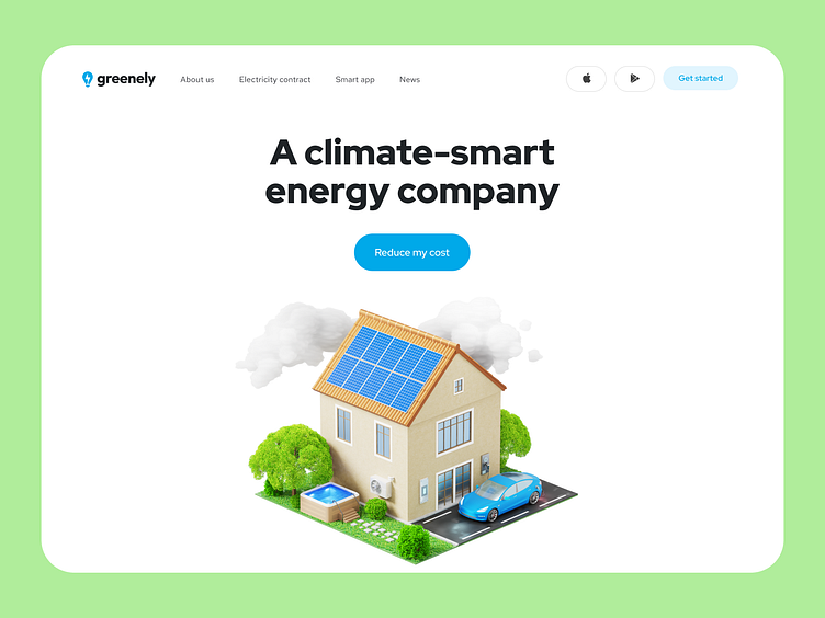
Greenely - Landing page design for a smart energy company
Greenely is an electricity company that optimizes electricity using innovative technology via the app on your smartphone. Also, it helps customers to decrease their consumption.
Main task
Create an eye-catching landing page that would stand out from the competition and evoke users' emotions while visiting the landing page. During the ideation stage, we came up with an interesting idea to use 3D on the main screen but in an unusual way 👇
Our solution
The big 3D house with all Greenely tools - is the main focus, wow-effect, and makes the interactions engaging. As you scroll, the home zooms in and shows a detailed view of every feature the app has.
After this memorable animation, we shed more light on all application features and show real screenshots of the interface in order to arouse maximum trust in the users and explain how everything works and what the benefits are.
The logical final action, to which this story about the product was leading all the time, is a call to action — download the application.


