Bee & Battearn
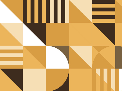
It's been a minute since I've shared things, but I'll still leave bad puns for my titles. Brand pattern I designed, giving a mid-century vibe for specific touch points with the brand. Particularly loved how the sharp angles in the majority of the pattern played off the curves of the logotype.
More by Todd Fooshée View profile
Like

