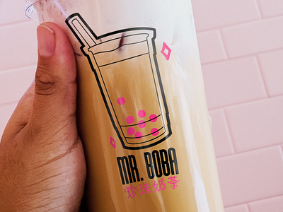
Mr. Boba
Mr. Boba specializes in high quality boba with a modern twist. Mr. Boba offers a variety of fruity & aromatic flavors to drive your taste buds wild, and they were looking to expand the franchise; they requested some stand-out branding to match their bold flavors.
They required a main logo, submark logo, packaging, to-go bag, and a store sign.
Bubble tea is on the rise amongst younger audiences, especially Gen Z. To invent a brand that not only stands out, but connects with their audience, I found inspiration in kawaii or "Meng" culture; things like Studio Ghibli films, manga, and anime have resurfaced as mainstream interests amongst Gen Z, and cute culture with it. I chose a bold, fun sans serif as the main typeface and a cute, pink Chinese typeface for the secondary.
Because the company's identity is more playful than luxurious, and because their audience is young, I chose a youthful illustration and bright color palette for the logo and branding.
More shots on website.
