Harmony Tea
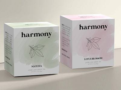
Harmony is a company that makes and distributes authentic green tea. Their product is made with affection and a high attention to detail. They requested a logo and package design for their brand that would reflect this love for detail and craftsmanship.
Since green tea originated in China and is extremely popular in eastern Asian countries like Korea and Japan, I conducted some research before deciding on a look for the brand. I took inspiration from Chinese traditional art and the Japanese enso symbol, creating a soft, gentle brush stroke for the packaging that would help it stand out against competitors in its artistic simplicity. This simplicity and minimalistic design aids the brand's reputation as peaceful and serene.
I thought this gentle wash could be a fun way to introduce different flavors, changing the color depending on the type. I chose to pair this brush stroke with a detailed illustration to bring Harmony's attention to detail front and center in a delicate way that contrasted many competing brands.
More shots on website.
