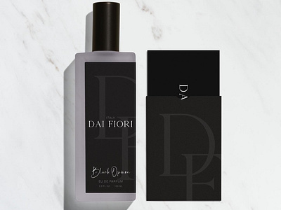
Dai Fiori
Dai Fiori is an Italian perfume company that wanted a re-brand to go along with their release of 3 new limited edition scents; Black Opium, Daisy Dreams, and Lost Cherry. They wanted an appealing and delightful logo and package design that would stand out on the shelf for consumers.
Most fragrances for women feature lighter, more delicate colors in the packaging and logo; to stand out while still maintaining a sense of luxuriousness and high quality, I chose to go for solid black for the packaging and brand identity. I paired it with a thin serif font and an overall minimalistic, to-the-point design to portray the product as elegant, classy, and sophisticated.
To develop this brand, I started by finding images that brought me inspiration, like a moodboard; then I began to develop the primary logo, secondary logo, and then moved onto the packaging and print materials.
More shots on website.
