Gun Store Rebrand
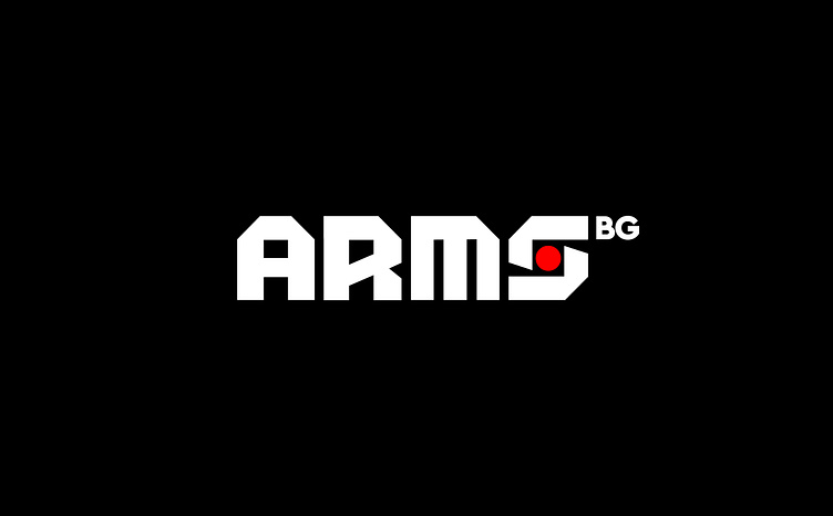
I was recently approached by one of the largest retail gun stores in Bulgaria to help them rebrand as their old logo and identity were outdated and underwhelming. The owners wanted to keep the old look of the logo and the gunsight letter “S”. To make the logo work, I had to make the letters more distinct and special – rugged and angular custom lettering was created to form the new logotype.
The main challenges with the logo redesign were the need to retain brand recognition and to also appeal to a broad target audience. Customers include hunters, security firms, campers, and outdoor enthusiasts so the identity had to appeal to all of these target groups, without prioritising or excluding any group. Creating a logo that is distinct but at the same time appealing to a broader audience is one of the biggest challenges in logo design.
After revamping the logo, we focused on the website UI, more specifically, UX icons and banners for the landing page. A gun store’s merchandise comes in a lot of different types of weapons and equipment and those needed to be sorted into categories for a better user experience. Icons were first sketched by hand and then digitised and refined.
A comprehensive style guide was created with color & font recommendations, dos and dont’s, logo applications and guidelines.
Finally, I created a series of banners for the landing page reel to highlight the most notable brands and products that the gun store sells.
You can visit the store and find out more about their brand here.


