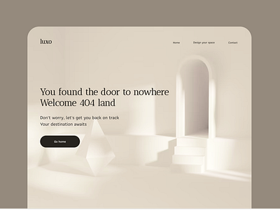
DailyUI #008 - 404 page
🔥Hey there! Are you ready for more exclusive design?
This is my #008 Daily UI design.
Design Hint 💻
Design a 404 page. Does it suit the brand's style? Is it user-friendly? It might sound mundane, but not evertyhing can be flash or glamorous. Every day millions of people will be landing on 404 pages. You have an opportunity to help them in a way that's useful and asthetically pleasing.(It's up to you!)
The Idea 💡
404 pages, the bane of every website owner's existence. But what if I told you it could be a secret weapon for boosting user engagement? Let's turn those pesky error pages into a cool experience with awesome design.
Final Thoughts 🧠
The 404 page, the ultimate test of a designer's creativity. But let's be real, it's not always easy to find the perfect industry to match the error page design and make it stand out on the Dribbble community. Therefore, I focused primarily on the aesthetics of the design. From now on, my portfolio will be a mix of different designs and styles. I want to push the boundaries and challenge myself. So stay tuned, you never know what I'll come up with next!
Share the love, press "L" or "F" if you ❤️ my work!
If you want to stay up to date with my work, head over to my profile and follow me. 🎨
