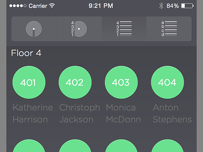
Dark semi-Flat mobile UI
Mobile UI for displaying patients by proximity, alphabetical order or anything in between.
Subtle semi-flat approach and dark design, as it is an underlying menu level to the whole, brighter coloured app interface.
Something like this is what I hope future iOS design will trend towards, as with plain flat design, content and navigational elements are often insufficiently separable.
Check out the attachment for full pixels!
More by Bernd Bürger View profile
Like

