Homeless: branding, logo design, visual identity
Homeless
Know about the Homeless: Homeless is a retirement home. Those who help single elderly people with accommodation who have no place to stay. And this is where the word Homeless comes from.
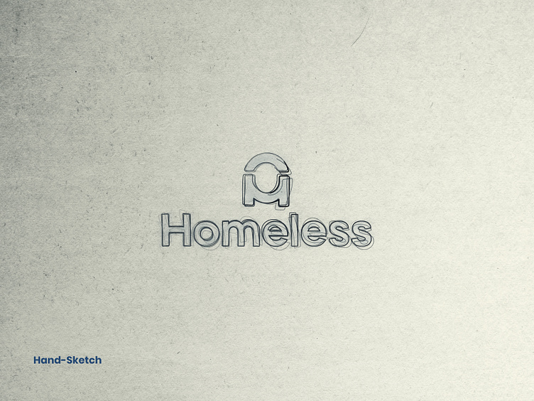
Working process: Since Homeless is a social organization, the work created a place of love in our hearts. The work is done in such a way as to create an emotional impression about the homeless at the first sight.
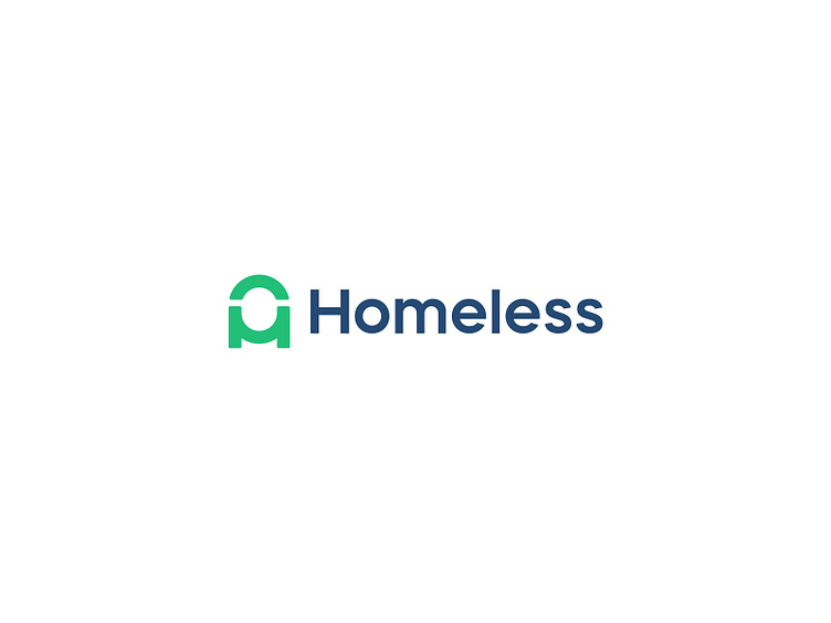
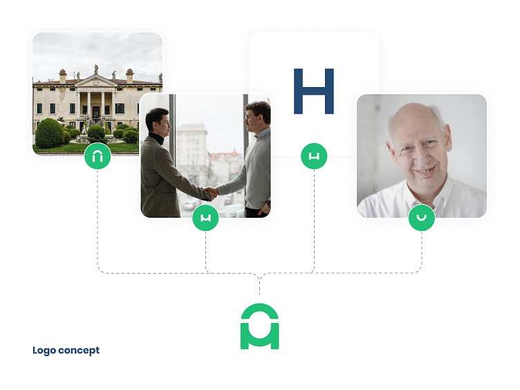
Logo Creation: Since Homeless is a social organization and has a heart connection with it, the corners while creating the logo are designed in such a way that it conveys emotion. The logo is created by Home + Handshake + Smile + Letter H. The details of these are given in the presentation.
Color: Since the work is of a retirement home, refresh and trust are very necessary here. So Green (Crayola) color is used to represent refreshment, Metallic Blue is used to represent trust, and Dark Gunmetal is used as a secondary color.
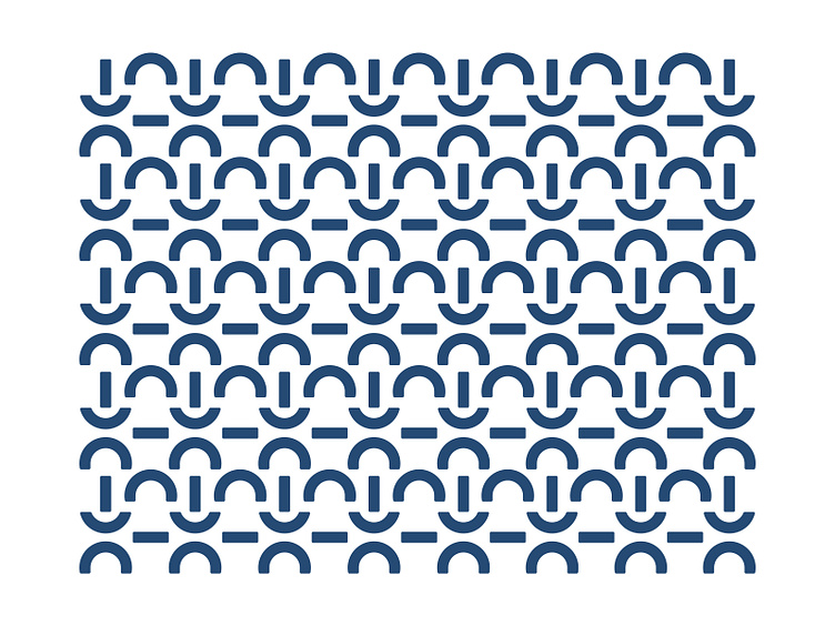
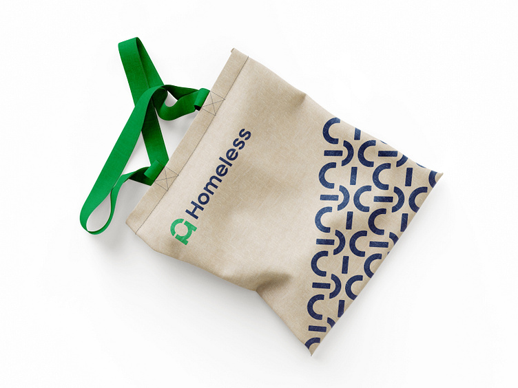
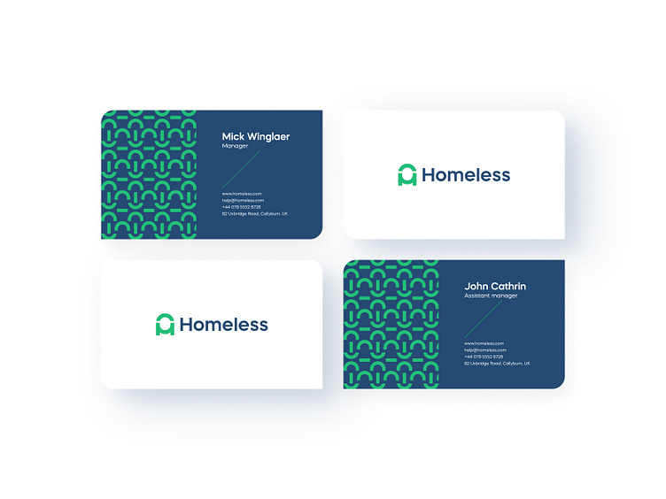
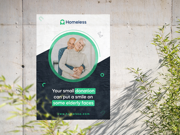
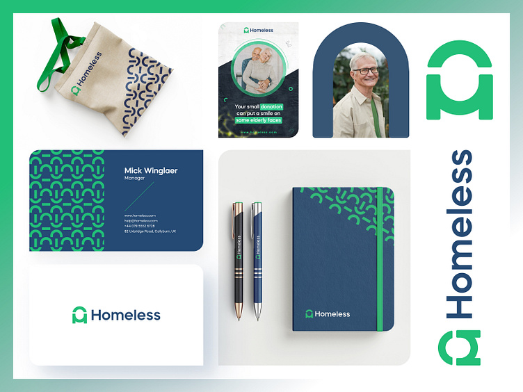
Branding: Logo icons and patterns are heavily represented in Homeless branding and marketing, making the company's icons and patterns memorable to people. Hope you enjoy the process and the complete banding. Your valuable feedback is welcome. Share your love and don't forget to follow us.
Who are we?
Kahaf is a dynamic and trendy design service agency. We usually help tiny & extensive companies to do Logo, Branding Design, UI/UX design, Mobile apps, and Product design. We receive the entire design process and think out solutions that work for businesses and users. Finally, we are cautious about work deadlines.
Let's start a project: hello.kahaf@gmail.com