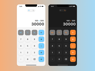
Redesign for iPhone calculator
Redesign for an iphone calculator, why? Well I asked my Instagram followers if they liked using iPhone calculator. Here are the insights I found:
-New users didn't know how to erase, so I added an erase button.
-Several users found it too long to change the color for the calculator by going to settings, so light and dark mode switch was added.
-New color scheme was added to highligh the symbol buttons.
Please feel free to leave feedback, and if you like it press L.
Enjoy!
Instagram: @FredUIUX
More by Alfredo Cáceres View profile
Like
