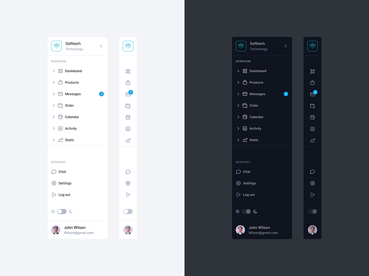
Dark mode sidebar navigation
Hey Dribbblers 🏀,
Dark theme is one of the most requested features over the past few years. Both Apple and Google made a dark theme an essential part of UI. Dark theme’s reduced luminance provides safety in dark environments and can minimize eye strain.
Read more about case study on Medium:
https://medium.com/ux-planet/case-study-research-sidebar-navigation-b41272026c6d
Don't forget to press "L" if you enjoy watching this ❤️.
📩 Reach me at: dm.sergushkin@gmail.com
—
✨ My social Behance | Dribbble | Medium | Linkedin | Instagram | ux.sergushkin
More by Dmitry Sergushkin View profile
Like
