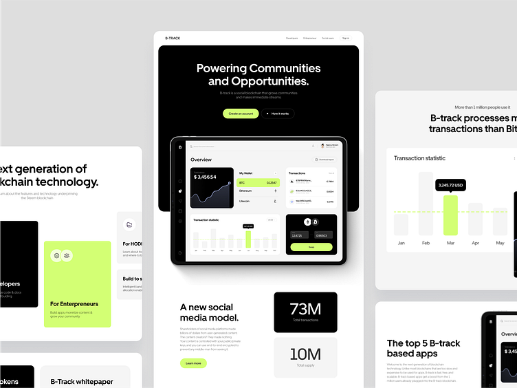
B-Track - Landing page redesign for a blockchain startup
B-track is a social blockchain that grows communities and makes immediate streams. Unlike most blockchains that are too slow and expensive to be used for apps B-track is fast, free, and scalable.
B-track based apps get a boost from the 1 million users already plugged into the B-track blockchain. It is a new word in the field of cryptocurrencies!
Our team made the first B-track design more than 3 years ago and many things have changed not only with design but with the market and communities as well.
Due to those changes, the time for redesign has come, and here are the results we achieved 👇
New design approach
We made the site minimalist, but at the same time with bright accents. The main colors (black, yellow and white) in combination perfectly complement and balance each other.
To reveal benefits and explain to new users how the platform works our team decided to make additional accents on the functionality of the web application by using dashboard interface elements for clarity with descriptions.
The solid visual hierarchy makes the web pages highly scannable and allows website visitors quickly get into the essence of the service and make desirable business action - create an account and try the platform.


