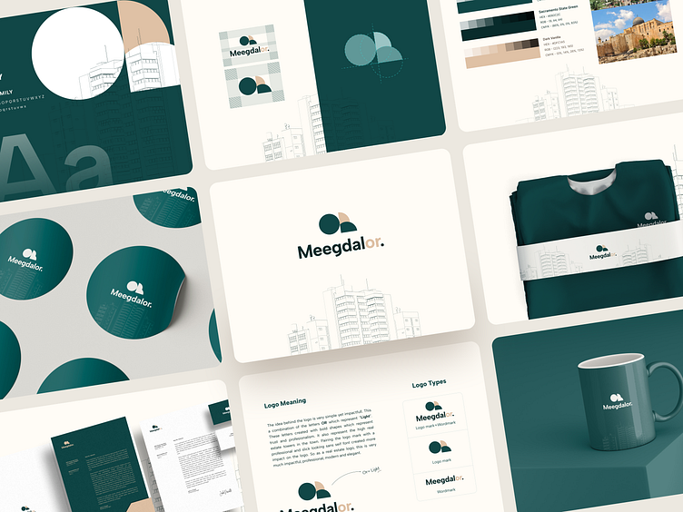
Meegdalor - Real estate brand identity guideline
About
Meegdalor is a real estate marketplace for developer projects dedicated to foreign buyers. They are more than just a marketplace - they offer a new way to present and sell projects. Their platform offers a detailed and informative experience for potential buyers. They provide information on location, amenities, and floor plans to give buyers a complete understanding of the property.
About The Logo
The idea behind the logo is straightforward yet impactful. This a combination of the letters OR which represent “Light”. These letters are created with bold shapes which represent trust and professionalism. It also means the high real estate towers in the town. Pairing the logo mark with a professional and slick-looking sans serif font created more impact on the logo. So as a real estate logo, this is impactful, professional, modern, and elegant.
Challenges
Meegdal in Hebrew means tower (most of the projects are in towers) and Or means light. And the combination of the 2 words Meegdalor means the Lighthouse. So the main challenge was to represent this feeling in the logo.
Solution
Following extensive research and workshops, we created a comprehensive branding plan that included a visually appealing design as well as effective messaging and positioning strategies. We summarised Payfinity's value proposition into a concise statement in order to clearly communicate it to clients, investors, and the media. We also developed brand guidelines to guide the use of our brand.
Meegdalor Brand Identity Design
.
⭐️⭐️⭐️⭐️⭐️
5-star rated agency on GrabStar
https://grabstar.io/profiles/ofspace/
.
🔥 We will provide a quick analysis and a free proposal for it. Don’t worry, it is secure and confidential.
.
✉️ Available for your long term or short term partnership 👋🏻 hello@ofspace.co
.
See How We Work At Ofspace


