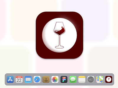
Daily UI 005: Icon
Process and Strategy:
I was thinking about apps that I would want to use. An app I really want to use (and really want to have reason to use!) is a wine catalogue.
I looked at lots of different wine glasses and evaluated how apps looked on the menu bar. I determined this would be an app icon for the dock on mac computers and I wanted it to both seem like a part of a larger group of icons as well as stand out. The central white orb was a way for me to make it visible as well as incorporate rich burgundy colors.
Evaluation:
Although I am pretty pleased with this as a daily exercise, it's a little too busy and subtle on the small dock scale. It wants to be more straightforward and less detailed on the small scale.
More by Meike Rossman View profile
Like
