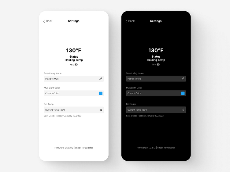
Typography Exercise: Font Size
Recently enrolled in Shift Nudge and working through the lessons. I'm on the second module which focuses on Typography. This specific lesson is on restraining font sizes with minimal UI elements.
I used only 3 font sizes to create a view for a fictitious Smart Mug app. What do you think? For bonus points I created a dark mode view as well.
Part 2: Font Weight
Another challenge of the Typography module is on the font weight lesson. In this exercise, we were asked to only use a single font size but use font weights to add focus and hierarchy. What do you think about the negative space around the temperature? Does the negative space draw your eyes to the current temp?
More by Patrick Eustis View profile
Like

