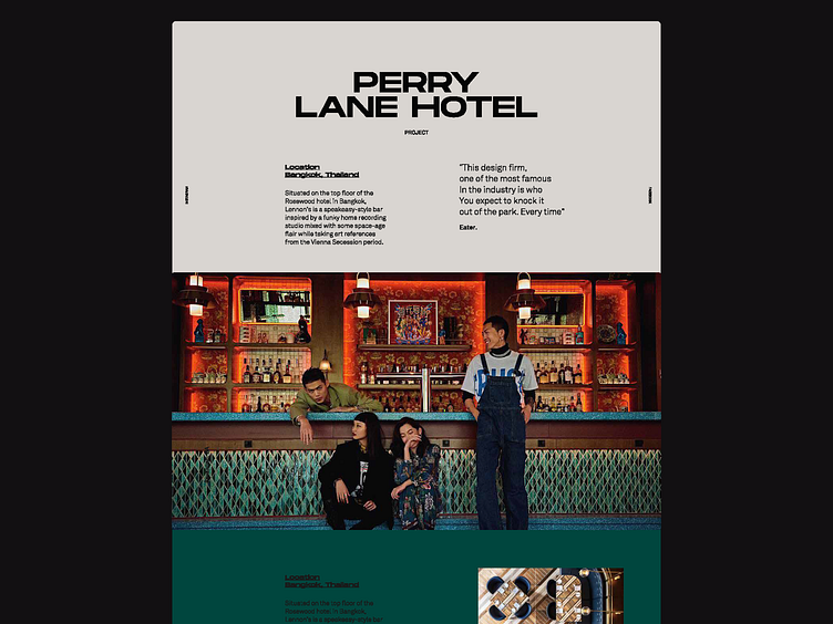
Website UI
Very different palette direction but here is some exploration we did for Avroko's site, specifically their case study page. A stark contrast from the work we ultimately landed on, but one of our favorites. Read the full case study
Shoutout to the rest of our collaborators: @H3l @makereign and @Niccolo
If you like this, don't forget to Press L ❤️
More by Wolf&Whale View profile
Like
