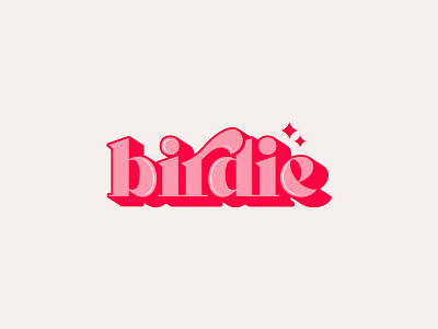
Birdie
Birdie is a new business that needed a logo for super trendy, high-quality press on nails and specifically for anyone who loves vintage style and wants to make a statement.
The brief for this wasn't overly involved but the client did provide a list of logos they liked for inspiration. The feel I got from what was provided was that they really liked the retro/vintage style, so this was the route I went down. I researched a plethora of typefaces, finally settling on one which I modified to give the logo uniqueness and an edge, along with adding subtle stars finished the logo off nicely.
More by Ascent Agency View profile
Like
