Free + Fair | Brand Identity
Free and Fair Litigation Group is a new, non-profit law firm countering the new authoritarian threat to democracy and fundamental rights. Their cases help guarantee free and fair elections and restore long-held, constitutional freedoms.
https://www.freeandfairlitigation.org/
Read more about it in the New York Times: https://www.nytimes.com/2023/01/11/nyregion/trump-investigation-prosecutors-law-firm.html
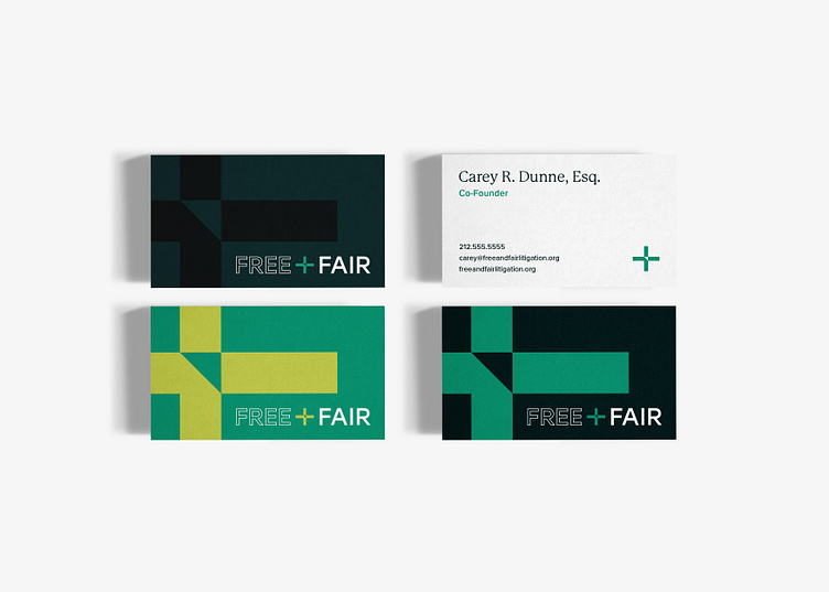
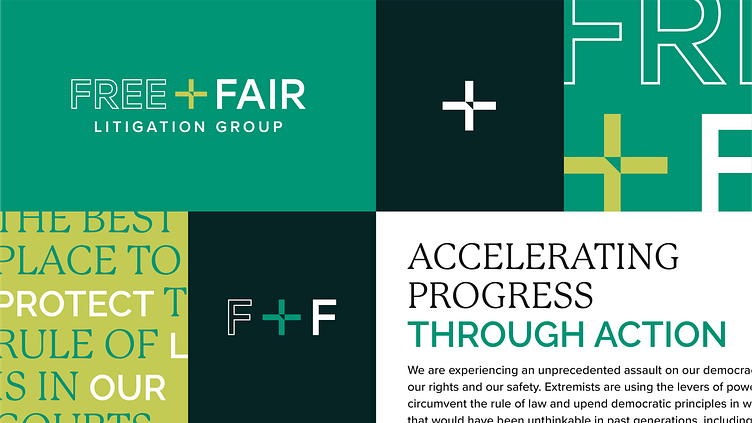
For the development of this logomark, I knew that the inclusion of the plus symbol would significantly contribute to the brand's iconic representation. With this in mind, an upward-pointing arrow was thoughtfully integrated, which encapsulates the essence of the law firm's overarching mission. This mission pertains to the advancement of democratic ideals, and the elements within the brand identity seamlessly resonate with this objective.
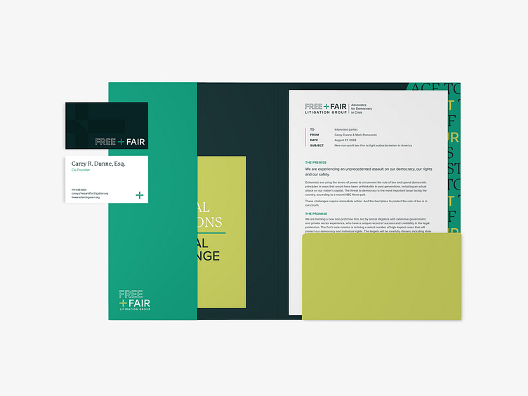
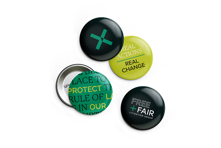
The selected color palette is deliberately crafted to exude a bold and commanding presence, which effectively captures and directs attention towards the brand's core attributes. A paramount consideration in this palette's curation was to avoid any semblance of association with political campaigns. The client placed significant emphasis on this differentiation, underscoring its pivotal role in conveying the unique essence of the brand.
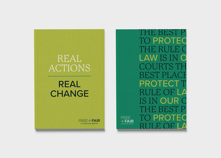
The typographical selection has been curated to convey a contemporary and refined aesthetic, seamlessly intertwining modernity with a subtle undercurrent of professionalism through the incorporation of a tasteful serif font.