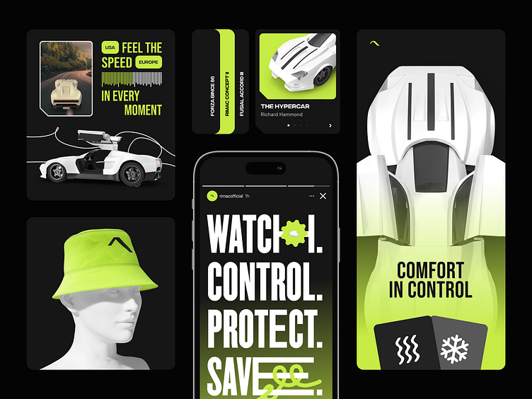
UI elements for car configurator | Lazarev.
What wouldn’t car brands do to accelerate their sales? Car configuration apps, the digital solutions allowing users to customize various aspects and parts of a vehicle, are good examples of how bringing the product closer to the audience in terms of deconstructing can work to your advantage.
Lazarev.agency developed its own car configurator design. However, in contrast to conventional boring “choose-the-detail” configurators on known car brands’ websites, we developed an MVP for an eye-catching and gamified product. What does such a solution’s UI consist of?
First of all, it’s color palette and shapes. Combined together, black and light green evoke the sense of a video game; we complement this hint with folded widget corners, distinctive UI shapes, and outstretched font.
Secondly, it’s the style of the icons. It’s purposefully minimized and completed in vectors: generally, this is what an average driver would seek while looking to turn on the AC or seat heating.
Driving should be safe and comfortable. However, we believe that a good design can go beyond these two metrics and make it fun on a daily basis. Agree? Drop a line here if it’s a yes: hello@lazarev.agency
Lazarev. site | Behance | LinkedIn | Facebook | Instagram | Twitter

