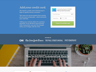
Credit Card Screen
Does the information on this screen make sense? (it's the last step in a short booking flow)
Is there too much vertical padding?
Struggling with striking a balance between brevity and enough info.
More by Matt Donovan View profile
Like

