Crypto APY Calculator | Daily UI Design Challenge 004
Daily UI Challenge | Day 004
For day four I was tasked to design a calculator of my choosing.
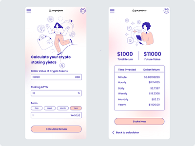
Today I was feeling like designing a mobile app. The concept I went for was an Anual Percentage Yield (APY) Calculator for crypto staking.
Investing can be a scary and intimidating concept for a lot of people. To help make the jump into investing a little less scary I wanted to go for a soft, friendly and vibrant visual style for my design. This visual direction helped guide my choice of illustrations, colours and rounded corners for my buttons and input fields.
I chose Poppins as the font for 2 reasons:
1) I like the way it looks. It helps contribute to a clean minimal branding experience.
2) It's readable. A legible font is one of the building blocks of accessible reading experiences online.
I aligned the input fields creating a vertical path to completion on the first screen. You will recognise this commonly used design pattern from filling in online forms. This type of alignment makes it easy for the user to follow and complete the next step. The impact is that it creates a neat, tidy and faster experience for the user.
On the second page, you will see a couple of similar pieces of investment information displayed beside each other. Labels were added to the information to provide context to the numbers and clarity to the user. The labels are secondary to the numbers that the user wants to see. The labels have been designed to reflect this by de-emphasising it by making it smaller. A couple other ways I could have de-emphasised it are by reducing the contrast of the text and/or using a lighter font weight.
Crypto can be volatile by nature. As a result, investors may only want to be invested in a crypto-staking position for a short time. With this in mind, the user has a breakdown of their investment based on different timeframes to help them make the best-informed decision.
As part of the information architecture for the page, the table was placed below as its secondary information for the user.
The table has been aligned with readability in mind. The text is left-aligned and the numbers are right-aligned.
Something I am aware of is the crypto space is dominated by men. A quick google showed results suggesting that only 24% of bitcoin holders are women. When I stumbled across these illustrations from the Figma illustration plugin 'Streamline' that featured women I was really excited to use it as part of my design to make the overall design more inclusive.
I find the web 3.0 and DeFi space super interesting, so this challenge was fun!
Let me know what you think.
