Dogana - The Dog walking App
Time changes, new circumstances arise!
The problem:
During the pandemic people acquired pets to make them company, while they were in quarantine working from home. By now, many of those new dog owners have gone back to work at the office and their dogs are alone at home, with a risk of suffering from stress, anxiety and depression.
The goal:
Dogana, our dog walking app, will let users schedule reliable dog walkers and follow their walks location in real time, which will affect dog owners by allowing them to see rates and decide who, when and how much will the dog walk be and follow them in real time. We will measure effectiveness by counting the number of daily effective appointments of dog walks through the app.
As a Product Designer I was tasked to build an app design and flow from scratch, to solve the current problem for dog owners mentioned above. For that, I did user and market research, I analyzed the results applying them on the wireframes, designs and prototypes and I conducted usability tests with dog owners.
The process:
Research and empathize
Following the Nielsen perfect number: 5, I conducted 5 interviews with dog owners between 27 y 45 years old.
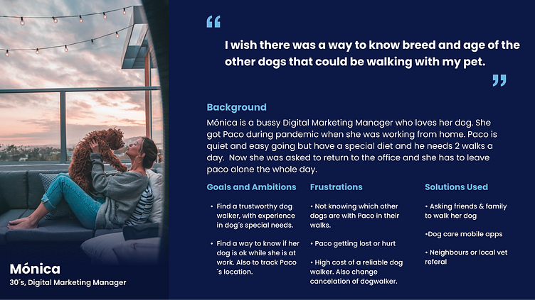
Based on the user research we can define our user as a dog lover, full time employee living in a big city, who lives alone or with someone that cannot go out with the dog (like a grandma) and does not have the time during the week to take proper care of their dog.
Market Research
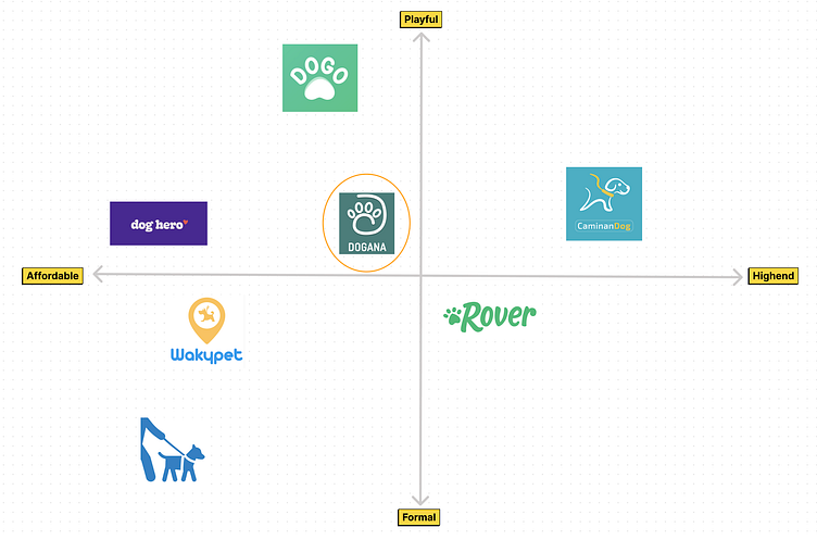
I studied and analyzed over 6 apps and I found that those apps offer several services regarding their dog's needs in addition to dog walking, such as house sitting, drop-in visits, training and general doggy care. All of the analyzed apps allow the user to create a profile for the pet; they also have guarantees and some other policies. Those apps already have real time GPS tracking of the walk, secure payment system and In app messages with the dog walker.
Some of the apps were friendly and intuitive, but there is a huge opportunity area to help users with no time make an appointment fast, easy and affordable. Only one app offers insurance for the pet, so it is a nice to have for our app Dogana.
Ideation
User flow
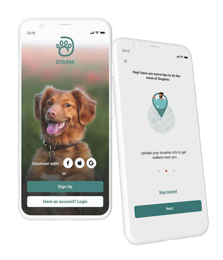
In this user flow we can see how the user (dog owner) can personalize the account, with different ways to signup and login, and a friendly onboarding process, because taking care of your best friend should be easy and reliable.
We found it important to classify dog walkers by distance, ratings, number of completed walks and also breed(s) of specialty.

Wireframes
Finding a dog walker
After the test with 6 users in V2 I decided to summarize information and reduce steps and friction for the user.
Some decisions are the following:
1. The first screen shows a list with all the dog walkers ordered by location from the nearest to the further one. This list shows rates, dog walker name, short description and picture, and amount of walks closed
2. In this 2nd version I added categories (filters) for this list of dog walkers.
3. On the Dog walkers profile, the order of the information changed. maybe is better to place first the picture and below to show relevant information such as rates, location and # of walks.
4. The User can now see reviews from other users and also a map to understand how close is the dog walker to them.
5. In this version 2 I simplify the schedule configuration. Now we set the walks duration to one hour, Frequency is now a select, so the user can select from one time, every week, twice per week... and now the pet for the walk is asked at the end of the schedule process, to avoid frustration if he does add or select a dog but there are not available time for this dog walker.
(It still keeps the schedule confirmation)
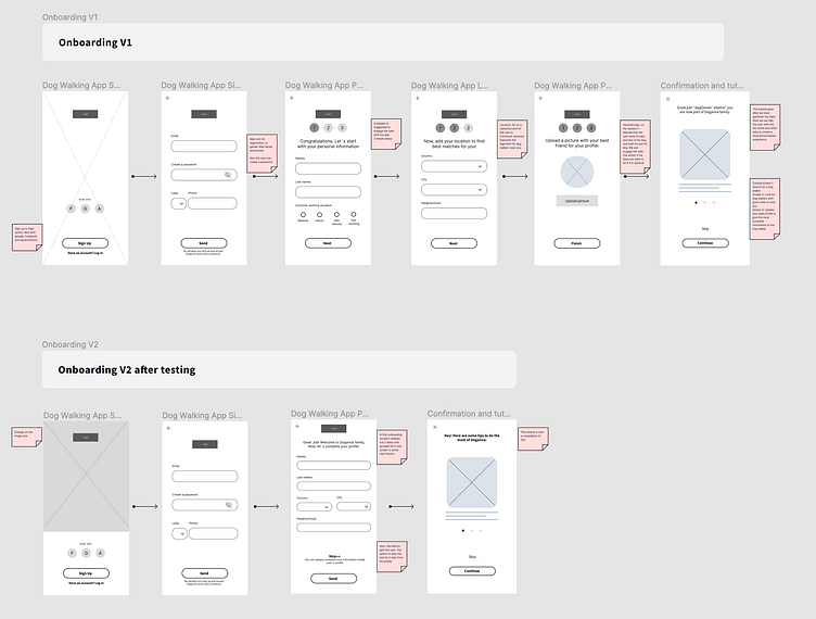
For the Onboarding, in summary:
1. I decided to add Sign up or login option. There are also a Google, Facebook and Apple buttons.
2. I ask for the user's main information for sign up, to gather data (email and phone) as a main business objective. Here the user can also create a password.
3. For the first screen I changed the image size. In the V2 onboarding versión I deleted the 3 steps (The stepper) and grouped all information required in one screen to avoid user friction. I also decided to give the user the option to skip this information filling, and do it later from his profile.
4. The tutorial is now a compilation of tips
Visual designs
Mood Board
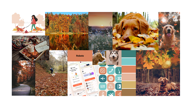
For this app Dogana, my inspiration was the autumn season. The colors are calm and reliable but also are comfort colors. I want to give a feeling of care, and warm (when maybe it's cold outside).
A similar feeling than a warm cup of cocoa on cold hands, is Dogana for people who cannot walk their dogs but someone caring and reliable can. I also want to show happy dogs because the main worry of people who cannot walk their dogs is the dog health (anxiety, depression or sadness)
Design System
For the screen's design I created clean and simple components, trying to give a neat look of the flow, and allowing the user to focus on the actions (tasks) rather than on elements on the screen.
I decided to use a “Greenish” color with good contrast (both with white and with black), combined with a "Pink-orange” with the objective to give some balance and variety. I did a mix between real life photos and illustrations to give a friendly touch but always with a personal and serious vibe.

Prototype and designs
This is the link to Dogana's prototype
I tested this prototype with 5 dog owners and the results were overall good.
Users could do all task with few stoppers. Here are some iIssues to highlight on the process:
1. The user didn't know when was filling or ended the singUp process.
2. About the tutorial, the users saw it very clear, easy to understand. He liked that he has a way to skip the tutorial.
3. About the dog walker list users used the filter, and it was fast and easy. 3 users suggested that If we have a favorite icon, we should have a filter by favorite
4. To schedule a walk with a dog walker was fast, but it was not easy to find where to cancel the appointment.
5. On the payment steps, some of the users asked if payment with cash was allowed, its a feature that could be added.
It was challenging to find users that fill the criteria, and also, because the tests were remote, there was a technology barrier (sharing the screen, connecting to meet, internet access, etc) bu at the end all went well.
Main changes on the designs
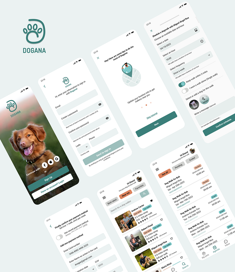
After the usability tests I made some changes to the designs mainly on adding confirmations and summarising information. Some of the changes are:

Conclusion
Here some of the screens of the final result:

Personal outcome with this case study
After working on Dogana, I realized the importance of structure and clear objetives before designing.
Analyzing and creating the app structure and components were core to progress faster and make changes in several screens at the same time and I wanted to practice the basics of UI.
I found really useful to create the responsive designs, using autolayout. In my current role, I used to have too many "issues" with the dev team with different screen sizes, but after responsive designs were delivered, this issues were not a problem any more.
I want to keep growing as a product designer, gathering data from users, testing features and delivering products that solve users day to day problems.
