Downtown Optics Hero Section

I first started out drawing 6 rectangles to kickstart the ideation process. For each rectangle, I sketched different strategies to lay out the hero image, CTA, and value proposition (Page headline + sub-heading below it). My main interest while sketching was playing around with different positions of the hero image, hoping to create a sketch that would pop out/look more impactful than others.
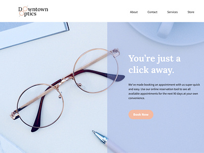
I ended up choosing a sketch where the hero image (in this case, the glasses) is positioned to the left of the page and the hero section details and CTA positioned to the right of the page.
The final prototype can be viewed here.