Platform
Digital legal service called Platform. They picked another name in the process, but I had several good ideas with this one.
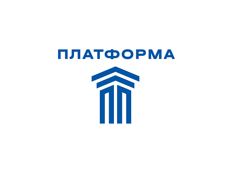
Here's the P-column idea. The column had to be artificially complicated so that it didn't look trivial, so an isometric view was chosen. The capital of the column is made up of two arrows. When the text is on top, and this is the layout I consider the most successful, the arrows point to the name. The whole sign resembles one big “up” arrow, due to which growth and development are also visible here.
More by Nikita Lebedev View profile
Like
