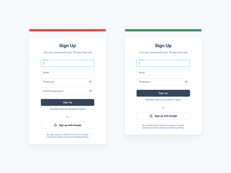
Sign-up Forms: password confirmation
Hey Dribbblers 🏀,
When it comes to sign-up forms, the more fields, the less likely a person is to want to complete the form. In fact, in one instance, less fields can lead to a 120% increase in conversions. [Resource] Avoid asking for too much information when the user signs up. Life is too short to spend it filling out forms. Ask only for essential information. Many websites or apps may ask for a ton of information as part of the qualification process. However, the best sign-up forms are always clean and simple to minimize friction. Ideally, your form should only ask for the information that’s absolutely necessary to register the customer in your database, such as their name, password, and email address. Of course, depending on your industry, you may need to collect more information than that, but try your best to make the form as short and simple as it possibly can be, and you’ll dramatically increase your conversion rates. It’d be best to save your users the hassle of carving out a username for your website. Instead, you should offer options to register with their phone numbers or email addresses.
Read more about case study on Medium:
https://medium.com/ux-planet/10-best-practices-for-creating-sign-up-forms-48470ce94b16
Don't forget to press "L" if you enjoy watching this ❤️.
📩 Reach me at: dm.sergushkin@gmail.com
—
✨ My social Behance | Dribbble | Medium | Linkedin | Instagram | ux.sergushkin