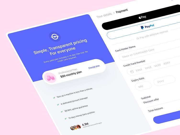
Payment page design
Hello, Everyone!
A well-designed payment page is crucial for any e-commerce website or app, as it is the final step in the purchasing process for customers. The payment page should be simple, easy to use and provide a sense of security for the customer's sensitive information.
For our latest design project, I wanted to show a visually stunning payment page that not only meets these functional requirements but also delights the customer. I drew inspiration from the latest design trends in the industry and incorporated elements such as bold typography, contrasting colors, and user-centric form.
The layout of the payment page is clean and minimalistic, making it easy for the customer to find the necessary fields and buttons. I also incorporated clear calls to action to guide the customer through the process.
Overall, My goal was to create a payment page that instills confidence in the customer and makes the experience of making a purchase as enjoyable as possible.
I hope you enjoy the design, and please let me know your thoughts or suggestions.
Have an Idea? Let's talk 💌
hello@basitkhan.design
Join me on Instagram: @Basit.design
Follow me on Behance | Twitter
Show your love! by pressing "L" ❤️
Stay Tuned!❤️✌️

