Note it - Visual Brand Identity
View Full Case Study👇


Hi Folks!👋
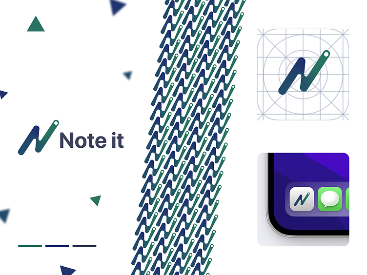
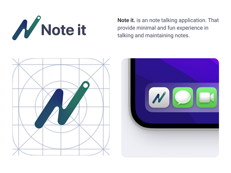
This shot is about Note it - An note talking application visual identity. Note It - is a platform for students and anyone who wants to take notes, study, keep journals, and do a variety of other things.
It has a clean, modern, and minimal design that will appeal to students of all ages. The colors are bold and non-intrusive, which makes it easy to read, especially on the small screen of your mobile device or tablet.
The logo is simple and easy to read at any size with a darker version at the bottom right corner so it stands out against the background when you view it on your phone or tablet. The icon is similar but less colorful so it appears more professional when used together with the logo in print.
-------------
Available for new project👇
📪 Email: ushinarabab@gmail.com
------------
If you want to follow me👇
Dribbble | Behance | Linkedin | Instagram
Like, comment, and share for more projects like this.
