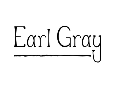
Earl Gray Tea Logo
This logo was a part of a larger magazine project that I did for a typography class. We were told to pick an item and design a logo for it. I chose Earl Gray tea. Ultimately, I wanted this logo to be a distinctly American take on the British tea that made the tea more accessible to my contemporary American audience. My hope is that the logo evokes a more rustic aspect of the drink.
The font was hand drawn and then brought into Adobe Illustrator to be finished.
More by Sophia Jesson View profile
Like
