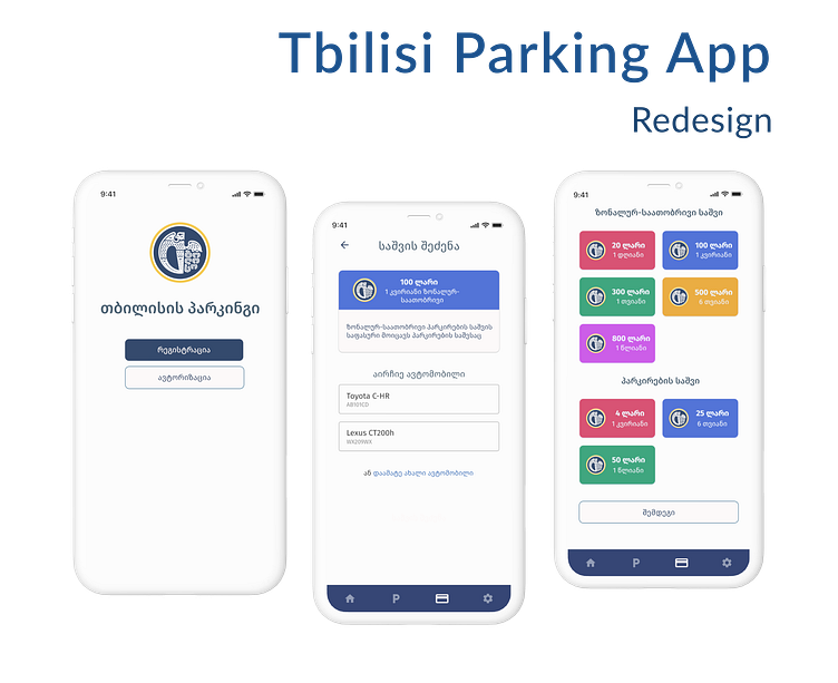
Tbilisi Parking App - Redesign
Tbilisi parking is the application for Tbilisi city residents and visitors with vehicles. It allows one to pay for the zonal-hour parking fee, find parking spaces in the city, and register free parking places for specific users.
Research
I did secondary research — I read the reviews on the AppStore and PlayStore. I conducted user interviews — On the Instagram story, I asked my followers if they used Tbilisi Parking and some of them replied.
I also conducted a comparative audit — as I mentioned, Tbilisi Parking App does not have direct competitors in Georgia, and I compared it to foreign parking app — Easypark.
I started the redesign process with wireframes, and step-by-step solved all major pain points. For example, in redesigned version, password recovery is possible with a mobile number. In this way, the user will receive the one-time password, log in and then change the password.
The registration process and password recovery were one of the biggest pain points amongst others.
Other major issues were the cluttered interface, lack of readability and accessibility, and puzzling information architecture.
The style guide
The style guide helped to create a sense of consistency, and overall, a better user experience.
As the main color, I chose blue because the logo of Tbilisi city is blue, as well as the parking signs. For variety, I used different shades and tints of blue.
As a secondary color, I used blueberry and its variations.
For the text and additional information, I choose a color named police blue and its variations.
For a better experience, the QR reader was added. In a real app, the user has to write down the number of zones, and the lot number. It's a time-consuming task.
Scanning the QR code is a simple solution, which saves users time and offers a better experience.
Read the whole case study here: https://medium.com/design-bootcamp/tbilisi-parking-app-redesign-case-study-49638e80b917


