Tetrisly Design System - Components
Hi all,
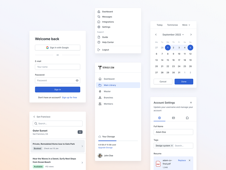
We’re excited to introduce a brand-new Tetrisly Design System! It’s coming along with Figma, React components, and usage docs. We carefully crafted UI components, leveraging the idea of design tokens. Now you can easily customize and start designing right away to deliver faster.
✨ Made with Tetrisly Design System and Tetrisly Icon Library ✨
What does make the new Tetrisly unique?
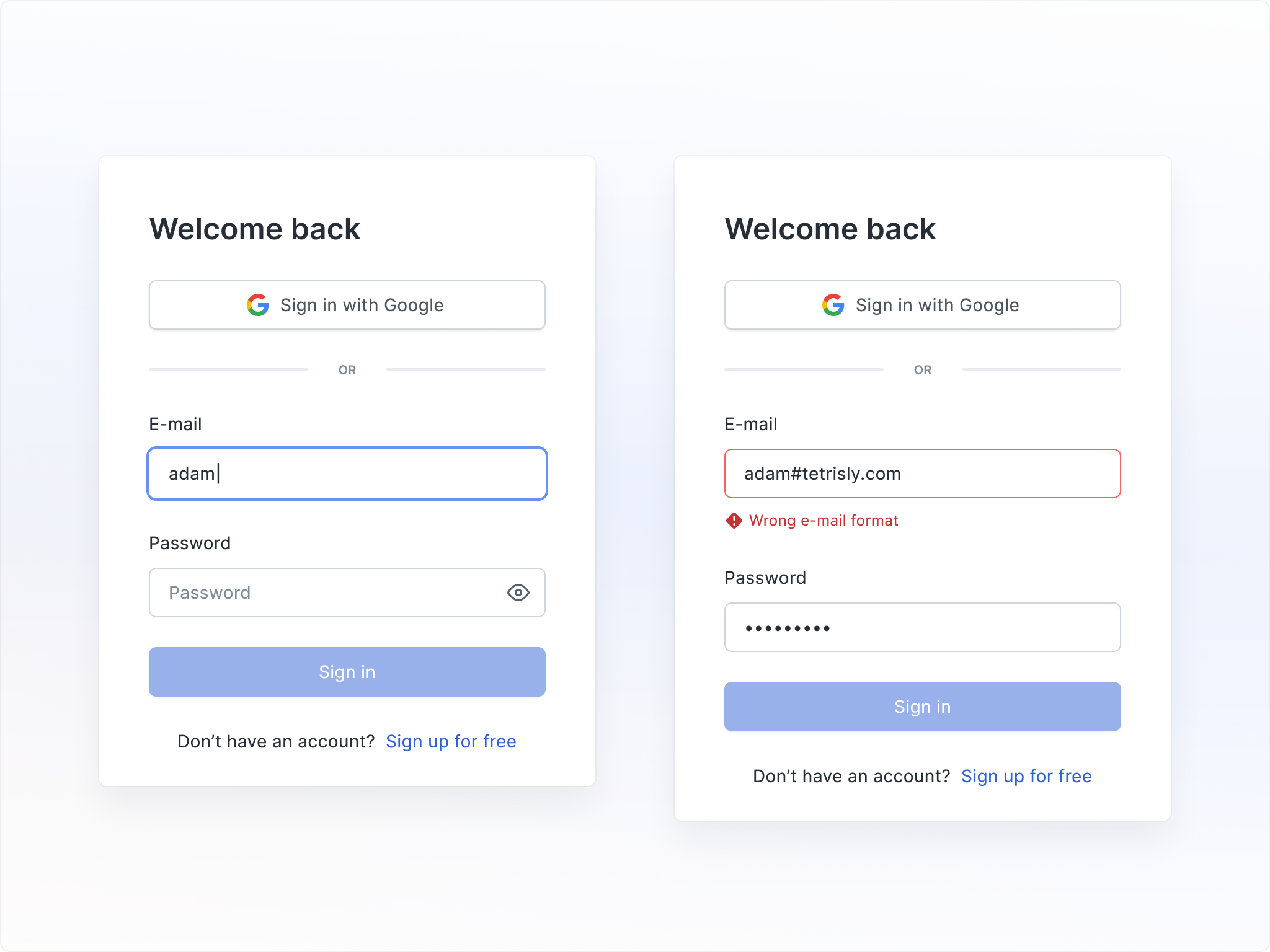
Carefully selected and well-crafted components
The usefulness of a design library shouldn't be measured by the number of components or variants it has. Get rid of junk inside your library. Ensure it only has carefully selected and customizable components without UX mistakes.
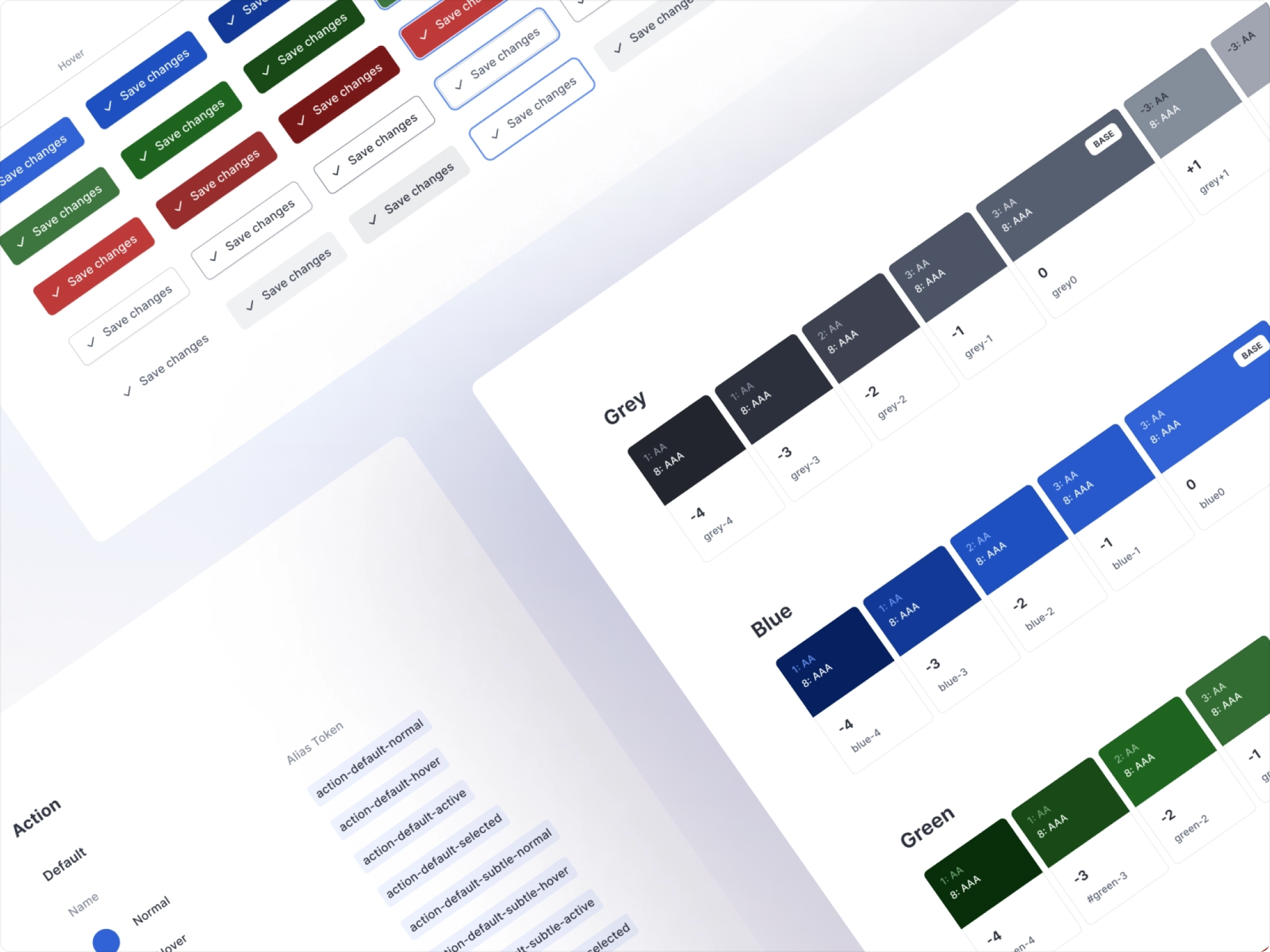
Tetrisly Color Palette, our contrast-based, easy-to-use color system
The whole range of colors is scalable and consistent, all of them shining in the same way. Each color is prepared based on WCGA standards with a completed contrast ratio test.
Our unique naming system allows you to add new shades after or before the base color. And no matter which color you use, everything will work well thanks to premade steps and contrast-based colors. The color system is designed within the HSL color space.
Color tokens to ensure consistency and customization
Color Token is a semantic representation of the color that helps understand how or when the token should be used. It helps to limit design decisions and place them in specific contexts.
Token can inherit the value from another token (i.e. Semantic / Positive / positive0 inherits the value from Global / Green / green0).
Design System Tool, our brand new Figma plugin to manage design tokens
It's just the beginning of our journey.
We’re working hard on React components and the design system documentation to build the all-in-one product design ecosystem to let you focus on your product.
Our backlog is full of new ideas and features to change the design game.
👉 Find out more about new Tetrisly
______
Follow Tetrisly on Dribbble and stay tuned for more inspiration


