Medical Mary – UX and branding audit

Medical Mary is a platform that offers CBD-focused products that are also powerful and trustworthy nutraceuticals.
Two Point One performed a UX audit for Medical Mary. The platform had significant bounce rates and was performing poorly owing to a lack of design consistency and various branding problems.
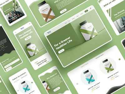
One of the most crucial findings was that Medical Mary was using outdated medicinal bottles and branding, as well as antiquated packaging. The bottles gave off the impression of conventional and critical medicine rather than a supplement. We suggested packaging adjustments along with the website UI improvements. We decided to create much more realistic and clean packaging to support the new aesthetic of the brand.
Since the designs had certain irregularities that did not support the brand, the colors were also changed. We just concentrated on the natural aspect of the brand. Instead of the blue and green combo, we kept green as the major color, utilizing very earthy tones as support colors, and extending this to the packaging as well to make the overall brand more unified and consistent.
Press "L" to show some love and to share your feedback in the comments section.
Have a project idea?
We are available for new projects at hello@twopointone.com