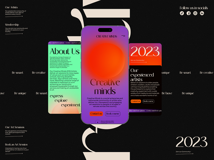
Ui design for learning platform
Hi creative people!
Today I want share with you these shots of mobile version of my project for this week. So, I hope you´ll like it! If you like it feel free to comment and press like. But even if you don't like it, tell me your thoughts about this work. Also, I´ll share full landing page so follow me to don´t miss it!
Press "Like" if you like it 💖
Have any feedback?
Feel free to share, your feedback will be highly appreciated!
Stay with me in Dribble or Behance
If you would like to order my services, please contact me
My email darinayefymova@gmail.com
"Made for creative and unique platform for people to learn and express yourself"
Idea behind this design is not unique but I want to make something different from all other designs thatvI see on this theme. So as you can see I try to make ui design differently than other designers and experiment with colours, layout and type as much ascI can but in the same time make theme of business remain.
Here the most what I want emphasise is that each learning path is unique and we're all different so that why I made like a "Sun" illustration because as you maybe know all stars are different in the mixture of gas and chemicals , so each star is unique the same as people. And colours should enhance this feeling.
Hope you're like this experiment and follow me to know and see more!


