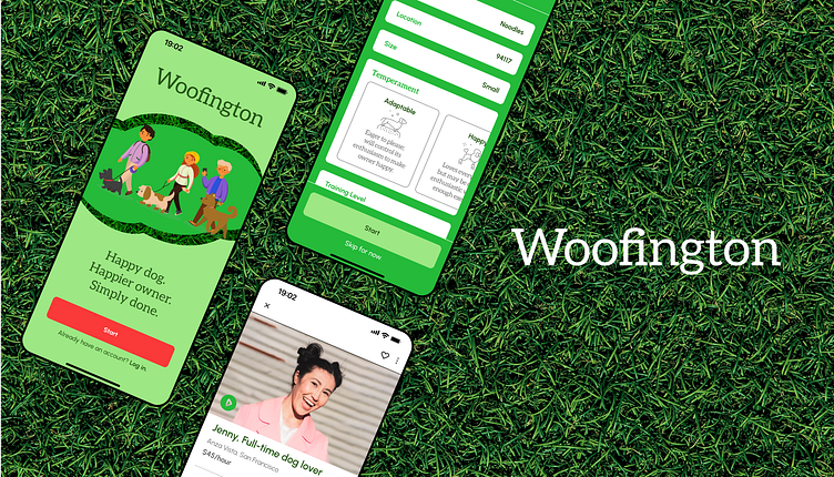
Woofington — A dog-walking app.
Woofington is a mobile app I designed as part of Dribbble’s Product Design Course. We were tasked with building a platform where dog owners could easily connect with dog walkers.
Research
I interviewed five dog owners to
learn about the pain points they encounter in raising their animals
understand the frustrations they had with existing dog-walking apps
discover what features they would look for in an app.
I also conducted a competitive analysis to understand the market and see what was and wasn't working in the industry.
User Persona
My target user is concerned with trust and quality. They're willing to spend a bit money more in order to get the care and support they need for their pet. While they're not the type to outsource all of their responsibilities, they do live full lives and want their dogs' wellbeing to be taken care of.
User Flow
For my user flow, my top priority was giving users having the ability to view walker profiles before needing to sign up. I also wanted to demonstrate early on in the user journey that Woofington, unlike other dog-walking apps, takes each dog's size, temperament, and training level into account when matching them with a care giver. The best way to do this, I felt, was to ask relevant questions during onboarding.
Wireframes
My first iteration of wireframes are featured in the image below.
When I initially created the user flow, I thought users would select dates from within the walker's profile. However, I realized that that might not provide the best user experience. For users who are in a time crunch, they're probably more concerned with finding a qualified walker who is available, rather than sifting through profiles until they find the perfect candidate. I decided it was best to include date selection within the search criteria, as well as within each walkers' profile.
I added a couple wireframes for users to select either recurring or one-off events within their search criteria.
Visual Design
I wanted Woofington to evoke feelings of trust, vitality, and joy so I chose green as the primary color. Green also symbolizes the grass in which dogs love to sniff and play.
The type families Urbanist and Aleo further connote trust and joy; the serifs of Aleo feel professional, while the round geometry of Urbanist feels friendly.
Final Comments
This was the first app I've ever created, so I learned a lot. Here are my key takeaways:
Design an app for a repeat user as well as a first-time user. I became really fixated on how to woo first-time users and ensure their pet's characteristics would be considered. I therefore spent a lot of time working on building out the onboarding process and less time creating features that would serve recurring users as well.
High fidelity wireframes go a long way. Since I'm a visual designer, I'm very habituated to sketching a rough thumbnail and then fleshing out my idea during the actual design phase. This habit unfortunately translated into the design process of this app as well, which I think resulted in me spending a lot of time building, re-building, and correcting components. I will certainly spend more time perfecting high fidelity wireframes before moving ahead in the design phase.
UI > UX. I learned, unsurprisingly, that I prefer designing to researching, so it will be exciting to work on a product for which the user research phase has already been completed.


