FIRST CLASS CANNABIS | Menu v.2
Medical Cannabis Price Page and Menu
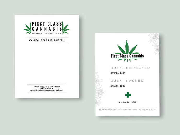
After making the informational menu for First Class Cannabis, I was later approached with the task of creating a template that could be easily edited by the owner. This is when I decided to create what is essentially a "letterhead". This design can be dismantled and used for other purposes as well. I separated it into three parts: The full version above, the header with just the logo, and the footer with the company information.
Behind the Design:
Technically, the price page was a part of the first version of the menu, commissioned soon after its completion, however, it served as my main source of inspiration when approaching the menu re-design. As can be seen, there is a slightly different version of the combination mark logo on the new menu, though it varies very little. Instead of behind split horizontally, the marijuana leaf is split vertically, and the subheading "Medical Marijuana" is added underneath the business name. The fonts used remain the same. The idea was to have different variations to be used depending on the need.
In order to allow the owner to easily and quickly edit the menu, I took the elements of this new design and plugged them into a Google doc, then formatted a grid with sections for the necessary information, applied the brand colours, and viola!
Fun Fact! In order to assure the header and footer images could not be accidentally moved or deleted, I made them the header and footer of the document. In Google Docs, when you choose to "insert header/footer", you can upload an image to serve as it. This also applies those elements to every page of that doc.

