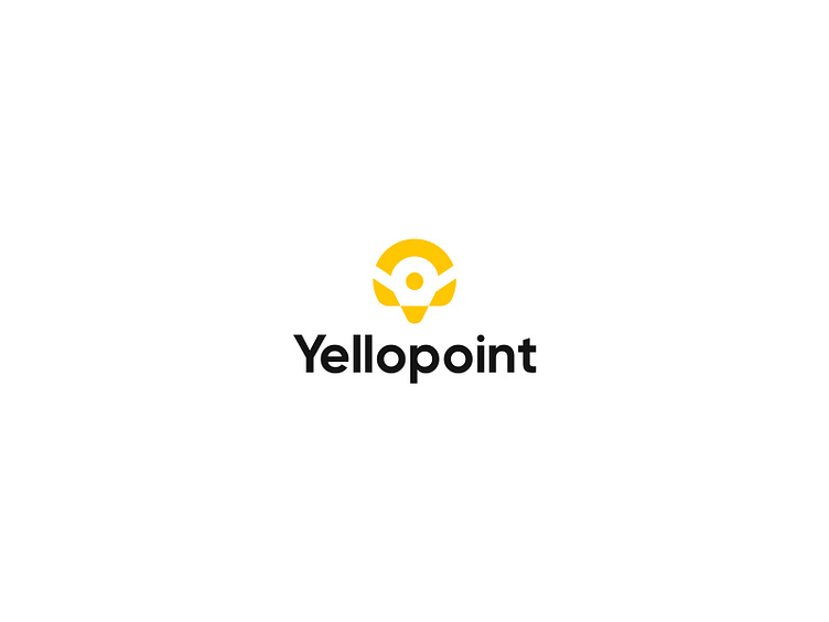
Yellopoint: branding, logo design, visual identity
Yellopoint
Project details;
The word Yellopoint is derived from a yellow point. Yellopoint is a co-working space company. Where all creative minds meet. You can share your knowledge, Freelancing, Remote job, and Teamwork here.
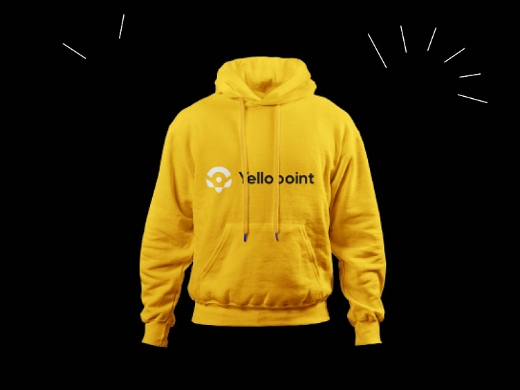
Challenge:- The biggest problem with the Yellopoint work was the color, our creative team was asked to work only with yellow and black. Which was really hard.
Solution:- Our creative team was a bit worried after hearing about working with only yellow and black colors, but later he had a nice solution. Yellow and black colors have been used 50-50 in Yellopoint work. Which is a new experience for us. And the work for two colors has been very unique, professional, and interesting.
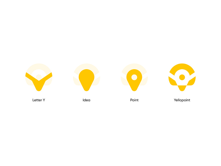
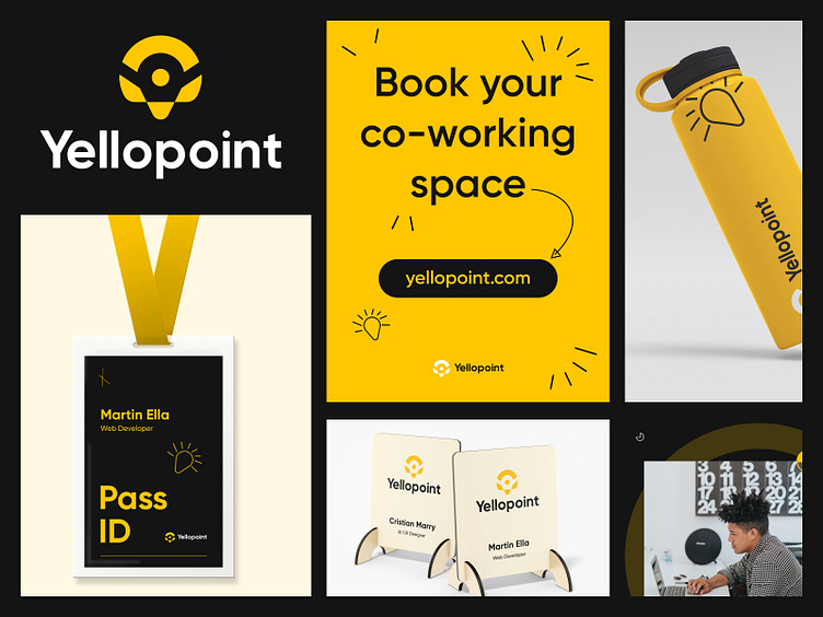
Logo Creation:- Since the word Yellowpoint is a combination of yellow and point, two concepts had to be kept in mind while creating the logo. The word yellow usually refers to the creative mind, as the color yellow expresses something creative. And the word point is used to mean a place where many creative minds will gather. So the logo is created by Letter Y + Idea + Point.
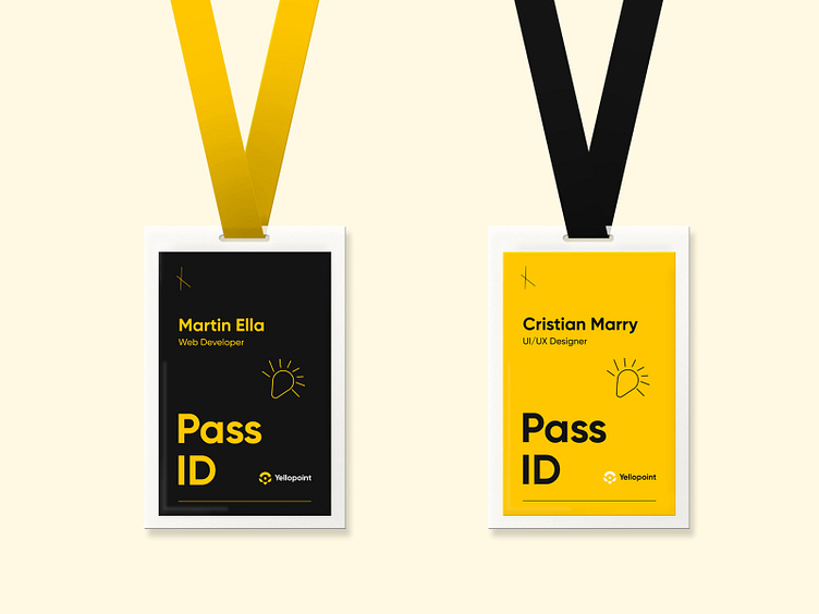
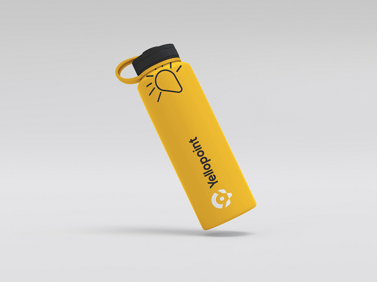
Branding:- Yellowpoint's visual and online branding has always worked within the shape of the logo to make the logo memorable to users. Hope you enjoy the process and the complete banding. Your valuable feedback is welcome. Share your love and don't forget to follow us.
Who are we?
Kahaf is a dynamic and trendy design service agency. We usually help tiny & extensive companies to do Logo, Branding Design, UI/UX design, Mobile apps, and Product design. We receive the entire design process and think out solutions that work for businesses and users. Finally, we are cautious about work deadlines.
Let's start a project: hello.kahaf@gmail.com