Updated Institutional Dashboard
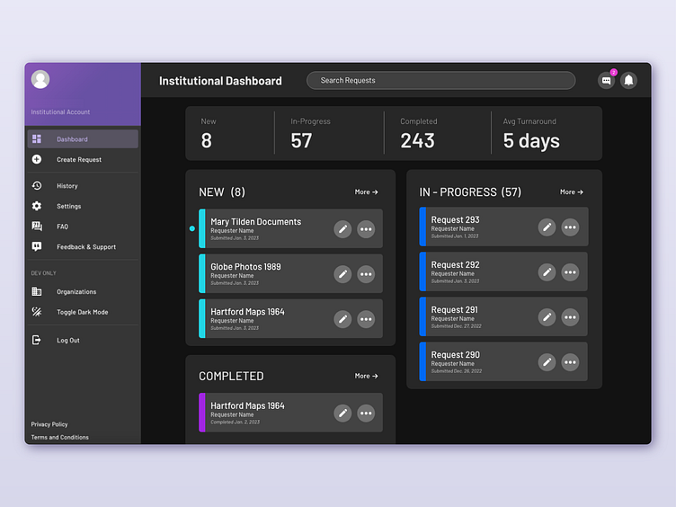
Above is an updated dashboard for the Sourcery web app. After prototyping the previous dashboard and performing UX research through surveys, results were used to tweak and redesign a more intuitive, optimized dashboard.
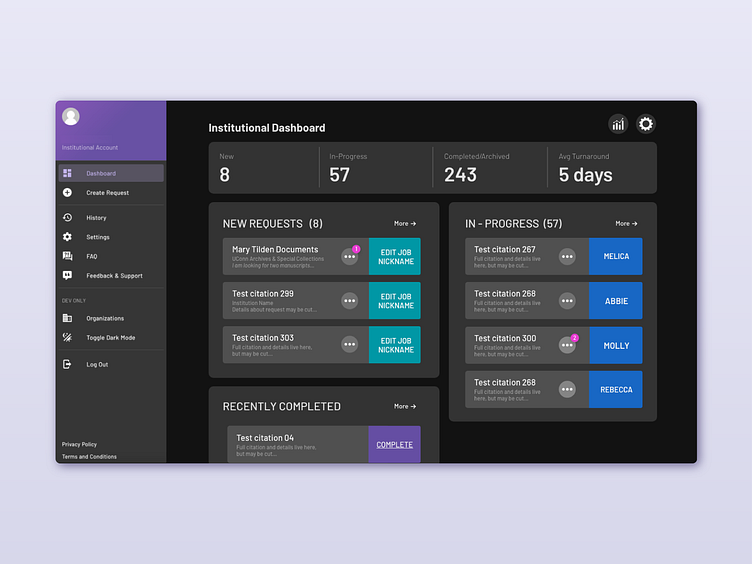
Previous Dashboard Prototype
I designed this dashboard as a rapid prototype to test and use with our partners. From here, I created a task sheet for our partners to work through. Once they completed tasks such as making and fulfilling a request, opening the chat, and moving a request, I asked questions such as:
What about the site or processes felt intuitive and simple?
What about the site or processes felt confusing or clunky?
Was there anything surprising or that did not perform as expected?
What was the easiest task to accomplish?
What was the most difficult task to accomplish?
Select the ellipses/more button on a request and change the label. What do you notice about this interaction? Is there anything unclear?
Request Card Changes
I learned from surveys and conversations that while the page layout was intuitive and organized, some of the information felt a bit redundant or too heavily prioritized in conjunction with other features.
Feedback:
"color coding is helpful, but the labels in the color boxes feel redundant"
"additional color bands to show the newest requests that have not been opened yet would be helpful"
"I prefer the settings and analytics button in the left side menu rather than at the top"
"I would like a way to search all requests"
"I would rather be able to see who has made the request and when it was submitted than request information"
My Solutions (see first image for implementation):
Color Coding and Newest Requests
I added narrow bands of color on the left side of the card to color coordinate requests. In order to show the newest requests without relying on additional color while also remaining familiar and intuitive, I added a small circle object to the left of the card. Once opened, these circles disappear.
Settings and Analytics Buttons
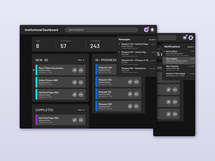
These two buttons were changed to message alerts and notifications. Read more about the message interface in my "Message Interface Case Study". Notifications now alert fulfillers to added internal notes, new requests, analytics reports generated, fulfilled requests, etc.
Search Feature
The search bar at the top of the page allows users to search across all request categories. In the future, the ability to add tags to requests, identify fulfillers, key words, etc. will be added to help users search their dashboard.
Card Information
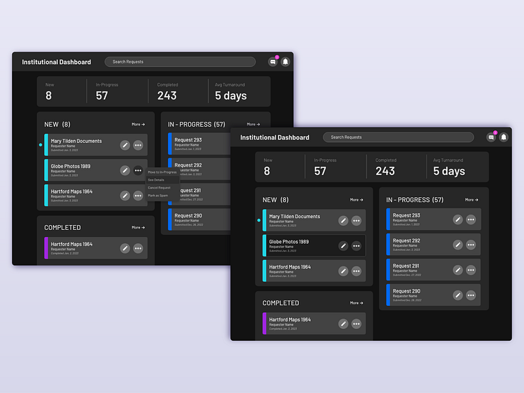
In the initial prototype, users could see the first few words of the request information. However, this was often the same across the requests and offered no helpful information other than screen clutter. I streamlined the card information to the request title, the name of the requester, and the date the request was submitted. This has also kept the cards looking more uniform and organized with the most helpful top level information. An "edit name" button was added to the cards rather than being a hidden feature behind the ellipses button. The "edit name" feature has been found to be particularly helpful for our users, and hiding it behind an additional two clicks didn't make sense. Now, the ellipses button opens a menu that contains options such as "Move to In-Progress", "Cancel Request", "Mark as Spam", and "See Request". Users can also see the request by clicking anywhere on the card.
Message and Notification Menus
Similar to well-known dashboards, I created a band across the top of the page to hold the search bar, the name of the page, and the message and notification buttons. To hold continuity for "new" interactions, a pink circle appears next to unopened or unseen notifications or messages. The timestamp has also been added so that users may quickly see how old a notification is. A feature I plan to include in future designs of the messaging menu is an icon to notify the user if they were the last one to respond to a message. I think this would be particularly helpful when organizing large amounts of communication across multiple fulfillers so that messages aren't accidentally forgotten about in the shuffle.
Moving Forward...
I wonder if users would find it helpful to have message notifications tied to each request as well as in the upper right button, or if multiple pink bubbles would make the dashboard feel busy and stressful. This user audience is primarily librarians and archivists who appreciate systems, organization, and reliability. I will be conducting user research and testing to find other points of friction and possible solutions.