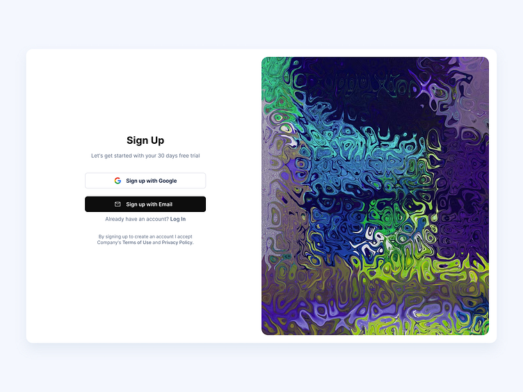
Sign Up page
Hey Dribbblers 🏀,
On sign-up, ask for as little as possible. Collect additional user data (such as name and address) only when you need to, and when the user sees a clear benefit from providing that data. Bear in mind that every item of data you communicate and store incurs cost and liability.
Read more about case study on Medium:
https://medium.com/ux-planet/10-best-practices-for-creating-sign-up-forms-48470ce94b16
Don't forget to press "L" if you enjoy watching this ❤️.
Thanks for checking it out!
If you have comments, let me know!
Say hello at 📧
ux.sergushkin@gmail.com
Visit my Website 🌎
dmitrysergushkin.com
For more inspiration, visit my profiles ✨
More by Dmitry Sergushkin View profile
Like
