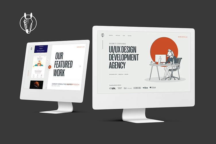
UI UX Website Design
The client's goal is to create a competitive design for companies that provide the same service in the market so that it is distinct, unique, and easy for the user.
In order to bring this design to life I had to find a way to turn boring numbers and statistics into something, well, less boring. Utilizing unique cartoon graphics and a bright color palette we achieved just that. Although we still don’t understand exactly what this tool does, at least it looks good.
the change:
Their previous Visual identity and a lack of clarity around their brand strategy and message were limiting their ambition in the growth market.
Our challenge was to transform what makes Incentex attractive, set it apart from the competition, capture human connections, and create a clear message. That would give the charity a more powerful voice and visible presence and reflect the internal culture they’ve built over 20 years.
the solution:
To deliver a soft re-brand for a client, I created a new visual identity with a more contemporary color palette, typography system, and logo usage. We wanted to keep the look very clean and simplify the product for the target audience. Combining product visuals and human-centric photography allowed me to create a new content strategy that was based on competitor research and user data. With these guidelines in place, I was able to focus on the website architecture and customer experience.
It was one of the hardest challenges to create the best look and user experience for this website to let it stand out on the market.
Contact me via Upwork to create your project


