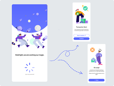
Load screen | Crypto wallet
After completing my Daily UI challenge 011 design, I felt inspired and went ahead and designed what the loading screen could look like for the Crypto wallet.
The underlying purpose of this design is to inform the user of the current system status. Providing the user with this type of interaction creates trust in the product and encourages open and honest communication in the relationship between the user and the product.
The design communicates to the user that the transaction from their prior interaction is occurring in the background. The loading icon helps give an expectation of a reasonable timeframe and that it won't take long. The user knows that to complete their ultimate goal of sending the transaction they need to wait at this stage of their user journey.
The language and tone of the message I used is playful and minimal. I kept the messaging simple because not all crypto wallet users may understand how blockchains works.
The use of technical jargon could cause confusion. For example, "One moment please, your transaction is being verified by a mining node." It will probably leave a lot of crypto-wallet users thinking: Is the transaction being sent? Why is a miner involved? Why is my transaction being verified? What's a node - isn't that part of the immune system?
It doesn't instill confidence in the product and could scare users off.
Designing crypto wallets to be accessible will provide a better user experience and ultimately encourage the adoption of this emerging technology.
My overall aim with the UI of the design was to achieve the Aesthetic-usability effect.
I was over the moon when I disovered the Moneyverse illustration set from the artist Pau Barbaro. I drew inspiration from the fun, playful and friendly style and selected a shade of blue as the primary colour for the design.
The colour blue is typically associated with trust and security. Both important values to communicate to a user when designing for the finance and crypto industry. Blue communicates wealth and tradition and complements the purple elements of the illustrations. Purple also being associated with wealth and ambition. Typically a user interested in a crypto wallet is financially savvy and is interested in wealth and emerging tech, making the colour choice a good fit for this design.
I then paired the illustration and primary colour with a San Serif font to give a clean minimal experience.
I was stoked with how the design came together. Let me know your thoughts.
