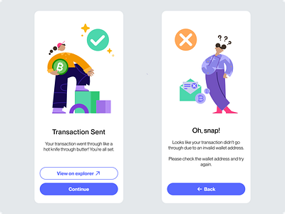
Flash Message | Daily UI 011
Daily UI Challenge | Day 011
Today I was tasked with designing a Flash message with the outcome for both an error and success.
I decided to design transaction flash messages for a crypto wallet app. Flash messages communicate with the user whether the status of their prior interaction was successful. It provides clarity and builds trust between the user and the product.
Along the user journey to complete a transaction the user would see these messages after clicking send transaction button and then going to a loading screen.
The headline and text block for the flash messages are short, so I used centre alignment as it looks better. Typically left-aligned text results in better content readability because it helps avoid unnecessary eye jumps, making it easier for the eye to follow. In this instance, I believe the centre alignment was a suitable fit. I would consider using the left alignment for text blocks more than 3-4 lines. The longer the text becomes more difficult the centre alignment becomes to read.
The audience and tone of the app is important to keep in mind when crafting flash messages like these. A quick google search revealed that crypto super users are young men between 18-29 years old. I chose to use a casual playful tone believing it to be more appropriate for a younger audience.
The success screen informs the user that their transaction was successful and gives them the option of viewing the transaction on Bitcoin explorer before continuing. This gives the user control and freedom ensuring a way to validate the transaction is clearly labelled and discoverable.
When designing for crypto it's important to design in a way to prevent slips and errors for the best user experience. But when an error does occur it's best to help the user recognise, diagnose and recover from errors.
Following the advice of Usability Heuristic #9, the error message screen informs the user that their transaction is not successful and provides the user with some potential steps to troubleshoot the issue.
For the visual style, I went for clean and minimal. I chose blue as the primary colour as blue is typically associated with trust, reliability and wealth. I felt it was a fitting choice for a crypto wallet.
I chose a customisable illustration set by the artist Pau Barbaro from the Figma Plugin 'Blush'. This allowed me to create illustrations to help communicate to the user a successful transaction or an error has occurred visually.
For the error message I chose to use an orange colour instead of red as I feel it still communicates something went wrong but isn't as jarring. Orange typically is associated with a warning and I felt it was appropriate for this type of error message as it's more likely to be a user slip-up than a system error.
I chose a rounded button style for this app design aiming for an overall friendly human-centred design. Rounded corners are generally associated with safety and make an object more approachable compared to its sharp-cornered counterpart. I liked this consideration and thought it to be valuable when desingig for an industry in which safety is valued and the technology can be a little overwhelming and scary for the general population.
Let me know what you think about this design.
