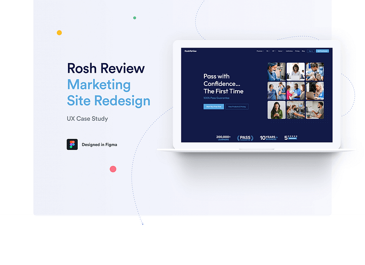
Rosh Review Marketing Site Redesign
What is Rosh Review?
Rosh Review features one of the largest question banks for medical studies, with practice questions that go above and beyond. Tailored to specializations in medical work, Rosh Review also offers Testing and Tutoring modes.
Aside from their popular question banks and study tips, Rosh Review also offers blogs, articles, and podcasts from professionals highlighting the field and tips for those aspiring to one day join the industry.
The Problem
Rosh Review’s question banks are grouped into products, which are aimed at helping learners study for specific exams. Customers were having trouble navigating to the most relevant product for their needs. These customers were also having trouble finding product pricing and understanding which product was the most appropriate for their needs. Rosh Review also wanted to better understand why there was a plateau in free trial sign up conversion.


