Otto Optics - Brochure
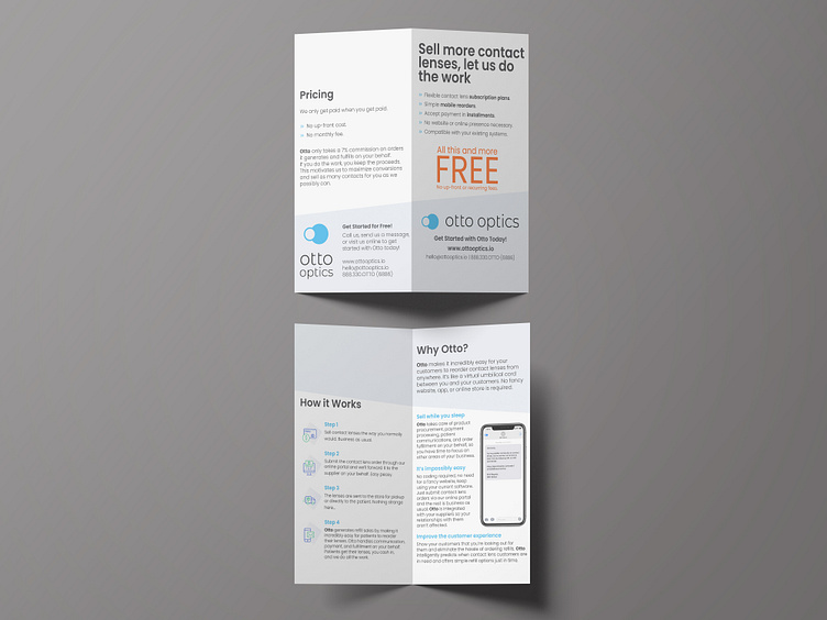
The client wanted a clean design for their informational brochure on their new service offered. Simple lines and colours were taken fro their existing brand guides and applied to the design. Accent colours were used to emphasize key information and a phone graphic placed for added clarification. Overall the brochure is minimalistic while still conveying all they key ideas required.
More by Rachel Stefan View profile
Like
