E-Commerce Landing Page Design
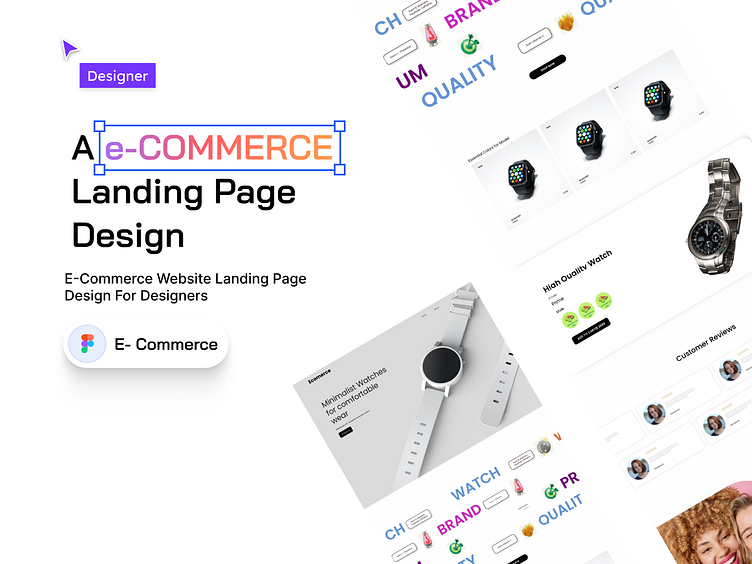
Hello! I'm excited to share with you my eCommerce landing page design. I'm hoping you'll like it.
I was approached by a small online retailer to design a landing page for their eCommerce website. The goal was to increase sales and improve the user experience.
To achieve this, I followed the following process:
Gathering requirements:
I met with the client to understand their business goals and target audience. I also conducted market research to understand the competitive landscape and identify best practices for eCommerce landing pages.
Creating wireframes:
Based on the client's requirements and my research, I developed wireframes that outlined the content, layout, and functionality of the landing page.
Designing the visual elements: I designed the color scheme, typography, and imagery for the landing page, ensuring that all elements were cohesive and aligned with the client's brand.
Working with the development team:
I worked closely with the development team to implement the design and ensure that the landing page was responsive and optimized for different devices.
Testing and optimization:
I tested the landing page to ensure it was easy to use and effective at converting visitors into customers. Based on the results of the testing, I made further refinements to the design to optimize its performance.
Result:
The new landing page was launched and received positive feedback from users. The client saw an increase in sales and a lower bounce rate on their website, indicating that the landing page was effectively engaging visitors and encouraging them to explore the site further.
Do you have any thoughts or feedback on the design? I'm open to hearing your ideas and discussing them further.
You can reach me at mdsarwarjahanr@gmail.com
Thank you!

