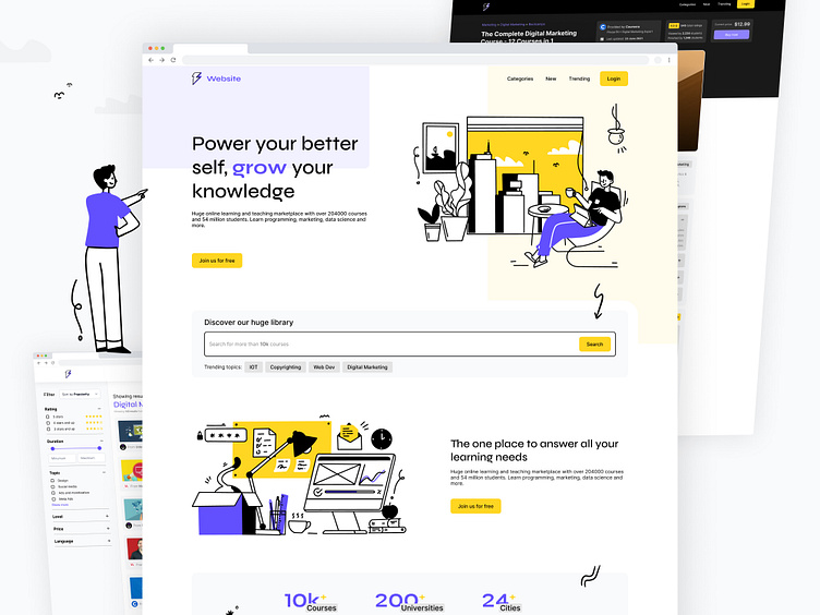
Courses Scrapping Website
About the project
A website that helps you discover and compare the best online courses from various platforms. With a clean and intuitive interface, users can easily search and filter through a wide range of courses in various categories, such as programming, design, business, and more. We put a lot of thought into the user experience and focused on creating a visually appealing design that is easy to navigate.
Grid-perfect
This was fun, though I need some more input from developers to optimize it more.
Auto-layout and variants
Thank you Figma!
Fully responsive
Dear developers, I feel your pain...
And some Figma trickery
Can you find out how the smooth colour switch was done?
Full landing page
So, what do you think about this one? Would you change anything? Share your opinion in the comments.
Follow me for more UI Design inspiration.
Hit "L" for some love 💛


