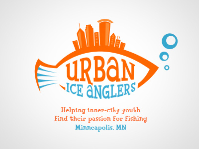
Urban Ice Anglers - Version 2
Which is better, v1 or v2?
Thought the 'r' in v1 being a hook to hold up the 'a' looked forced, went more subtle with the 'a' and 'c' having hook-like ends.
Logo for a Minneapolis based non-profit that aims to teach inner-city youths ice fishing and other outdoor skills. The client really liked the idea of the Minneapolis skyline in the fin, but it was a struggle incorporating the hook in a natural looking way. Feedback welcome!
More by Ryan Supalla View profile
Like
