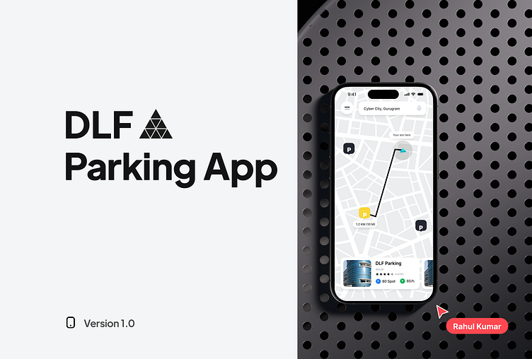
Parking App Casestudy
My Role
I led the Product Design-User Experience(UX) and User Interface(UI)-of this project. I also receive constructive feedback from two fellow designers in order to improve and get other perspectives about what I was designing.
Mains task
Customers Insights & Ideation
Building the Project Vision
Planning and scope define
User Interface & Experience
Motion & Interactions
Prototype
Conduct A/B Testing
Problem Statement
Due to overcrowded cities and lack of space, DLF is launching a fully automated (Lift system), and multi-story parking for bikes and cars. People are required to book parking spaces as per their requirements and pay the charge on an hourly basis.
🔎 User Research
In identifying the parking problem, I wanted to validate the problem by conducting user research.
For this, I conducted user interviews with multiple people residing in Delhi to understand their pain points and motivations. Some of the questions out of the set of questions I prepared are as below:
Do you own a car or two-wheeler? If yes, how often do you use it as a mode of transport?
Do you plan your travel every day before leaving home?
Do the places you visit regularly have parking spaces? Where do you usually park your vehicle?
How much time do you spend on finding parking (approx.)?
How do you check the prices of the parking spaces?
How do you make the payment for parking spaces?
🧑🦱 User Personas
I identified major groups that would be the potential users of a parking app, on the basis of which I developed the following user personas.
👉🏼 Key Pain Points
Finding a parking space close to the destination is a major problem.
Difficulty in knowing about the availability of spots in the parking before reaching there.
Prices for parking are not known by the time a user enters the parking.
Most parking, don’t accept digital payments.
Parking slips are the only proof given, if that gets misplaced you have to pay hefty fines.
Cash Change is not available.
Most of the parking app doesn’t give the facility to book for multiple days and to extend time duration.
Hard to find your car afterwards, especially if you forget your spot number.
Competitive analysis
In order to understand where exactly the existing app is lacking and what new features could be added in the updated version, I have done a competitive analysis of some of the apps that allow users to book parking spots.
Parking things
Wireframes
Design System
Onboarding Screens
Login
Home
Booking
Payments
Parking Ticket
Navigate to the parking location.
"The driver utilises their smartphone's navigation app to find the most efficient route to the parking location, taking into account real-time traffic conditions."
"The GPS device provided clear and concise voice directions, allowing the driver to easily locate the parking facility and park their vehicle."
"By consulting a physical map and following the written directions, the driver was able to successfully navigate to the parking lot and find an available spot."
Parking Timer
parking time starts, let's suppose if you are late, the charge automatically increased, according to parking time, with no penalty. Just pay the extra amount & exit.
Find My Car
User was able to easily locate their car parking location using the 'find my car' feature on their key fob. They simply pressed the button and Navigation.


