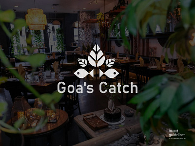
indian restaurant logo and brand identity
About the restaurant
"Welcome to our South Indian seafood restaurant, where we specialize in fresh fish dishes served on a banana leaf. Our menu features a variety of traditional and modern seafood specialties, all expertly prepared using authentic South Indian spices and cooking techniques. Our chefs draw inspiration from the diverse flavors and ingredients found throughout the region, and are committed to using only the highest quality and sustainably sourced seafood.
Our cozy and welcoming atmosphere is the perfect setting to enjoy a delicious meal with friends and family. We offer indoor and outdoor seating options, as well as a full bar featuring a selection of local and imported beers, wines, and cocktails.
Our attentive and friendly staff are happy to recommend dishes and help guide you through our menu. Whether you're a seafood connoisseur or trying it for the first time, we have something for everyone to enjoy. We look forward to serving you and sharing the flavors of South India with you soon!"
Design process :
I use the fish form as a symbol of the logo for two reasons.First, most of the dishes in this restaurant are fish items. Another reason is that the shape of a fish is more known as a symbol in South Indian culture. So the fish symbol will work as an emotion for the customer of this restaurant, and they will easily feel comfortable even if it's their first time in this restaurant.They served their food in a traditional way, on a leaf. That's why I used a leaf in this logomark.Fish and leaf perfectly represent the restaurant because these two are the main keywords of this restaurant.
Pattern :
I made the pattern very simple and clean by using only two symbols. The pattern is inspired by the fish and leaf symbol, which came directly from the logo icon, and consumers will be able to recognize the restaurant if they see the pattern in their take-out box or on wrapping paper.
Color :
From my research moodboard, I chose two colors as the main identity colors of this restaurant: "forest green" and "orange." Both colors represent the Indian culture and the restaurant because this restuarant has indoor plants and they serve their food on green leaves, so the restaurant environment is pretty much greenish, and the reason behind choosing orange is that it is the spice of the restaurant. India has a worldwide reputation for spices, and the restaurant uses those spices in their dishes. I chose orange and green as the colors that best represent the restaurant.
